Utah Tech
Utah Tech
Utah Tech
2023
2023


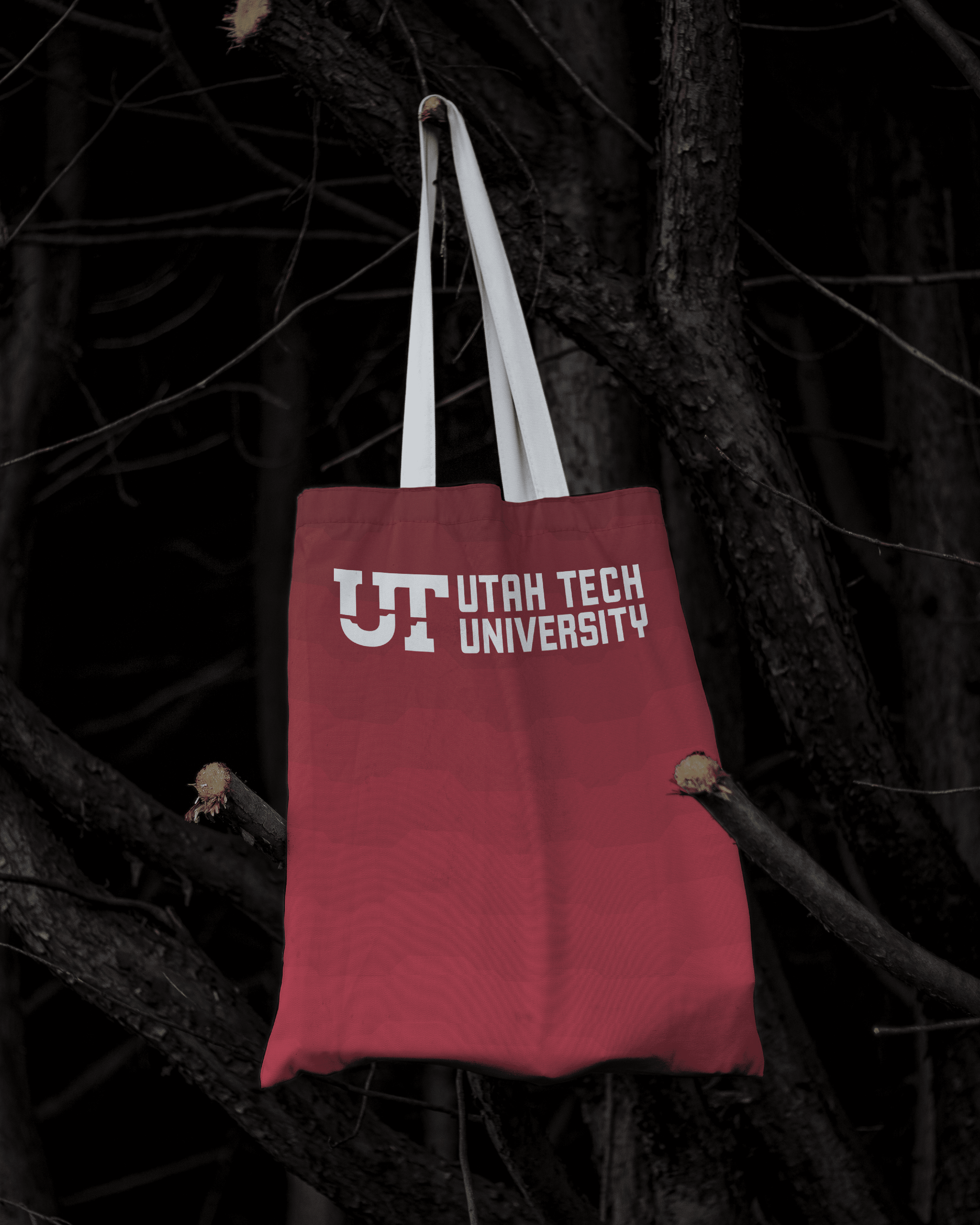
This project was a branding proposal for Utah Tech University following their recent name change. The existing branding removed elements that highlighted the beauty of Southern Utah, opting for a U and T connected in a way that mirrored the state’s shape—a concept already used by other regional schools.
This project was a branding proposal for Utah Tech University following their recent name change. The existing branding removed elements that highlighted the beauty of Southern Utah, opting for a U and T connected in a way that mirrored the state’s shape—a concept already used by other regional schools.
This project was a branding proposal for Utah Tech University following their recent name change. The existing branding removed elements that highlighted the beauty of Southern Utah, opting for a U and T connected in a way that mirrored the state’s shape—a concept already used by other regional schools.


My solution reimagined the U and T connection while splitting the logo horizontally: the bottom reflects the red rocks of Southern Utah in red, and the top evokes the sky in dark blue. These colors, already part of the school palette, reinforce the university’s identity as “trailblazers” while making the logo unique and regionally meaningful.
My solution reimagined the U and T connection while splitting the logo horizontally: the bottom reflects the red rocks of Southern Utah in red, and the top evokes the sky in dark blue. These colors, already part of the school palette, reinforce the university’s identity as “trailblazers” while making the logo unique and regionally meaningful.
My solution reimagined the U and T connection while splitting the logo horizontally: the bottom reflects the red rocks of Southern Utah in red, and the top evokes the sky in dark blue. These colors, already part of the school palette, reinforce the university’s identity as “trailblazers” while making the logo unique and regionally meaningful.


The resulting concept balances modernity with a strong sense of place. By incorporating the natural landscape and existing school colors, the branding conveys both distinction and pride, giving Utah Tech University a visual identity that is memorable and tied to its roots.
The resulting concept balances modernity with a strong sense of place. By incorporating the natural landscape and existing school colors, the branding conveys both distinction and pride, giving Utah Tech University a visual identity that is memorable and tied to its roots.
The resulting concept balances modernity with a strong sense of place. By incorporating the natural landscape and existing school colors, the branding conveys both distinction and pride, giving Utah Tech University a visual identity that is memorable and tied to its roots.