Texas Rangers
Texas Rangers
Texas Rangers
2024
2024
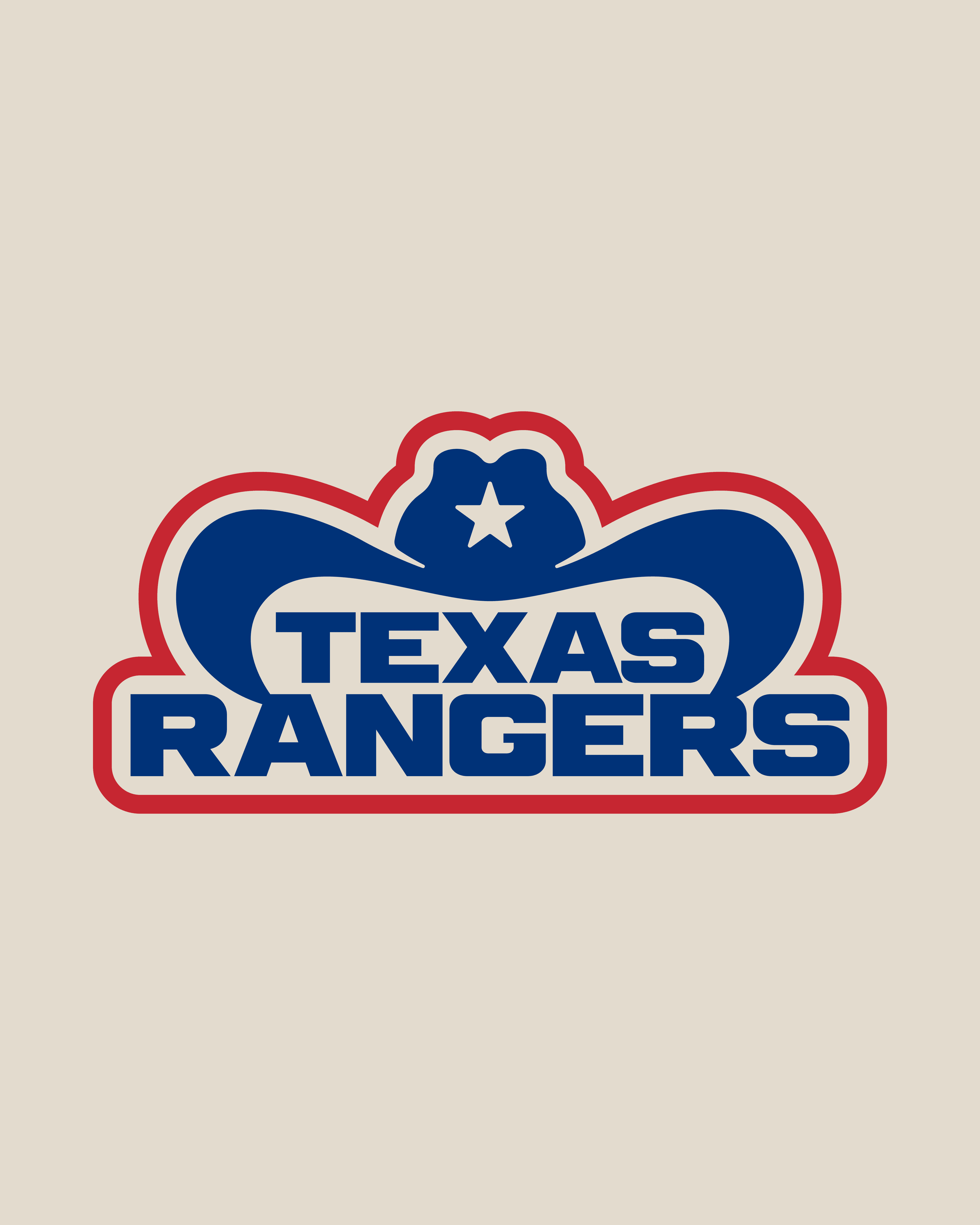

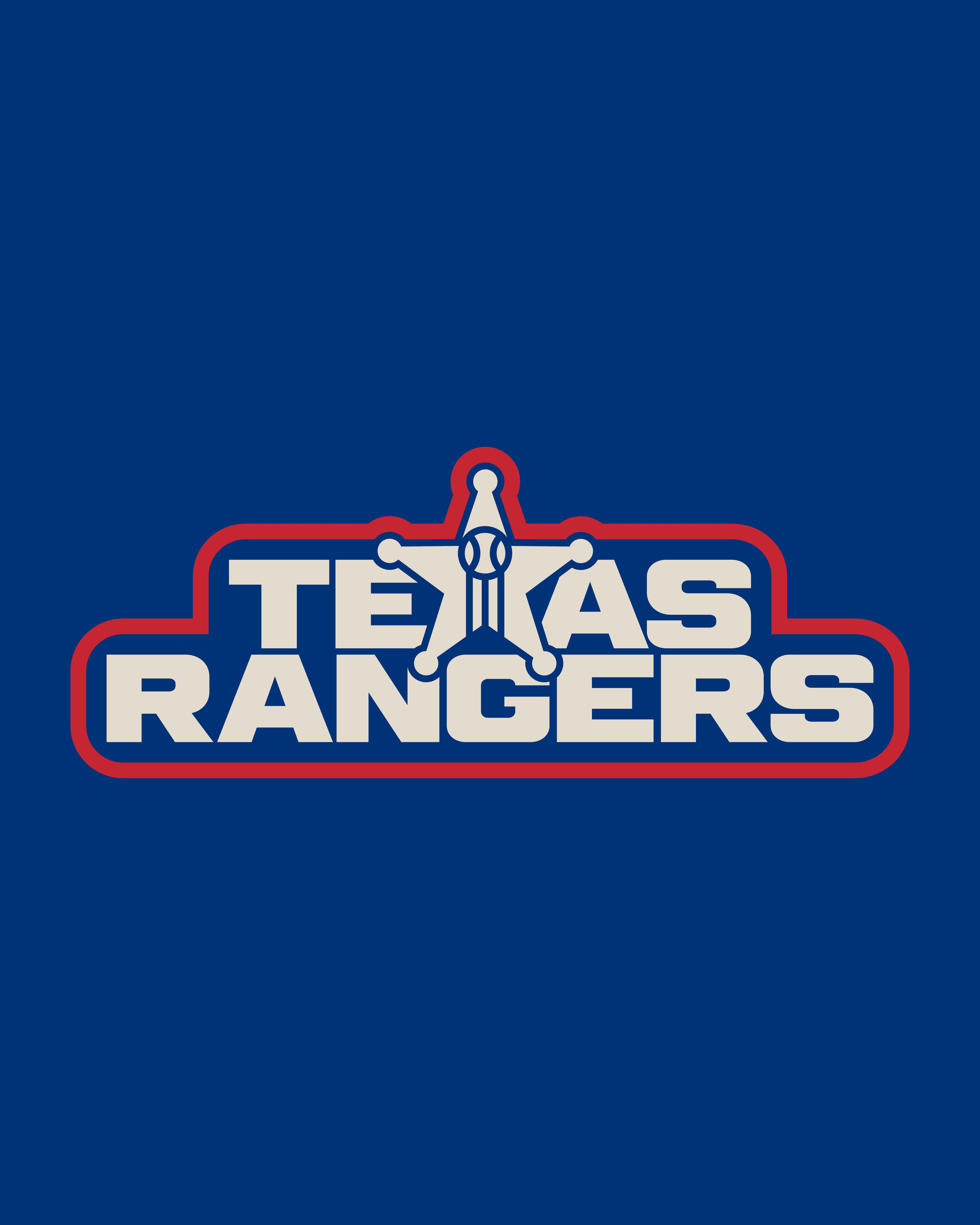
This rebrand for the Texas Rangers was created as part of a sports logo design competition. The challenge was to refresh the identity of the team while honoring their heritage and keeping them recognizable.
This rebrand for the Texas Rangers was created as part of a sports logo design competition. The challenge was to refresh the identity of the team while honoring their heritage and keeping them recognizable.
This rebrand for the Texas Rangers was created as part of a sports logo design competition. The challenge was to refresh the identity of the team while honoring their heritage and keeping them recognizable.
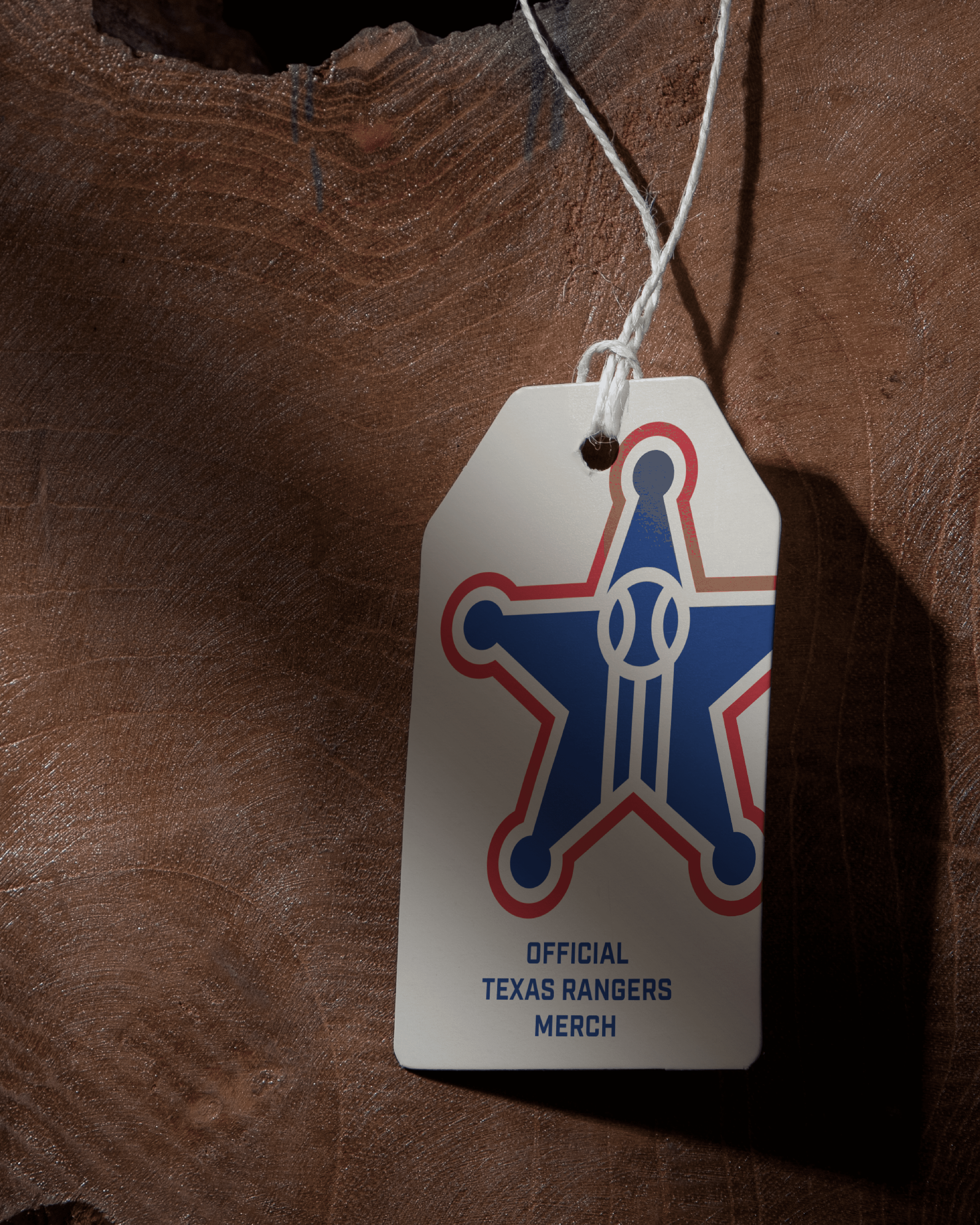

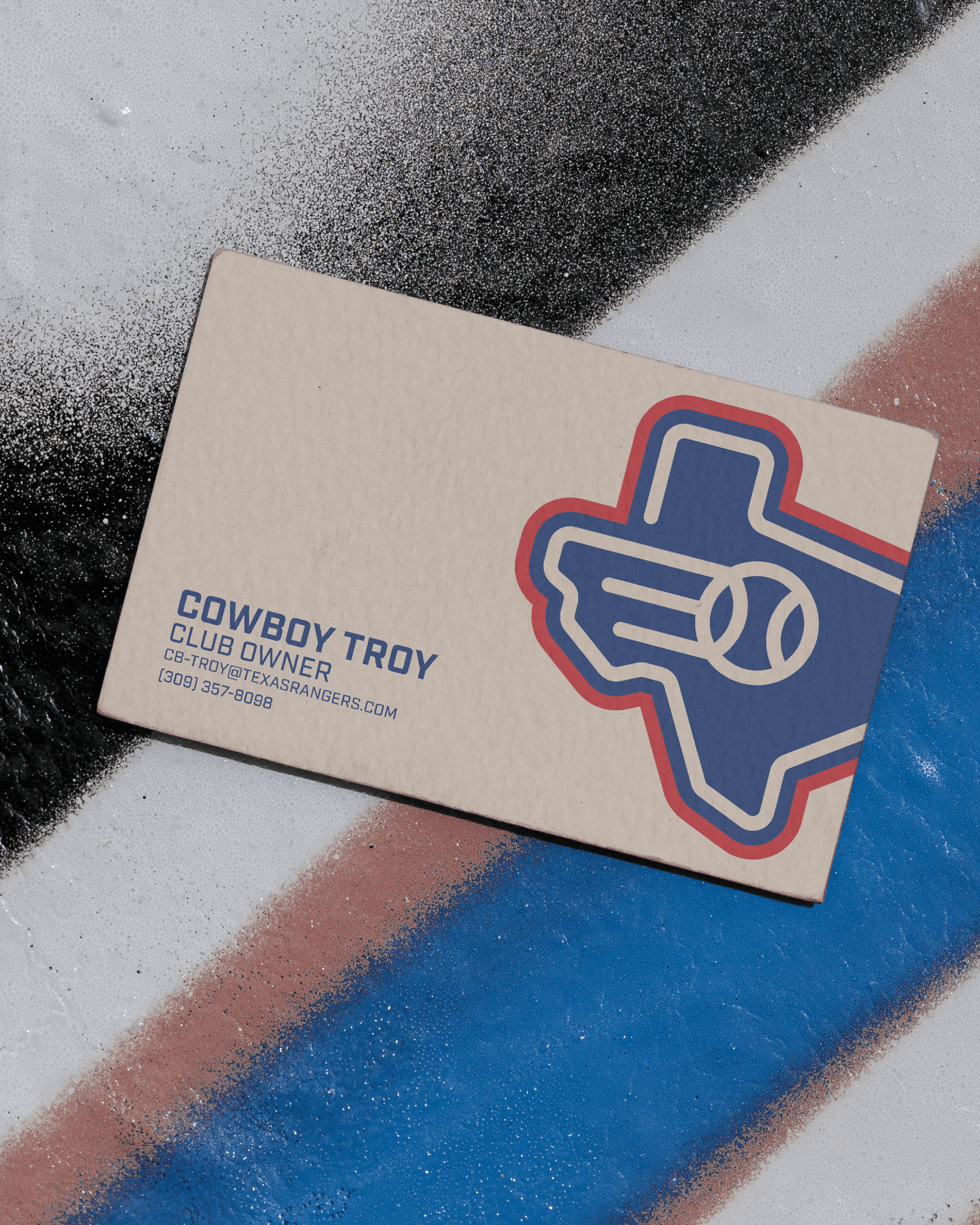
The work leaned into iconic Texas visuals—like the state outline, sheriff badges, and western cues—merged with baseball elements. Clean, single-weight line illustrations made the marks modern while still bold, with negative space used to tie everything back to the sport.
The work leaned into iconic Texas visuals—like the state outline, sheriff badges, and western cues—merged with baseball elements. Clean, single-weight line illustrations made the marks modern while still bold, with negative space used to tie everything back to the sport.
The work leaned into iconic Texas visuals—like the state outline, sheriff badges, and western cues—merged with baseball elements. Clean, single-weight line illustrations made the marks modern while still bold, with negative space used to tie everything back to the sport.

By maintaining the Rangers’ traditional palette while layering in fresh detail, the rebrand feels authentic and relevant. It respects the franchise’s history while introducing a system of marks that feel sharp, memorable, and competition-ready.
By maintaining the Rangers’ traditional palette while layering in fresh detail, the rebrand feels authentic and relevant. It respects the franchise’s history while introducing a system of marks that feel sharp, memorable, and competition-ready.
By maintaining the Rangers’ traditional palette while layering in fresh detail, the rebrand feels authentic and relevant. It respects the franchise’s history while introducing a system of marks that feel sharp, memorable, and competition-ready.