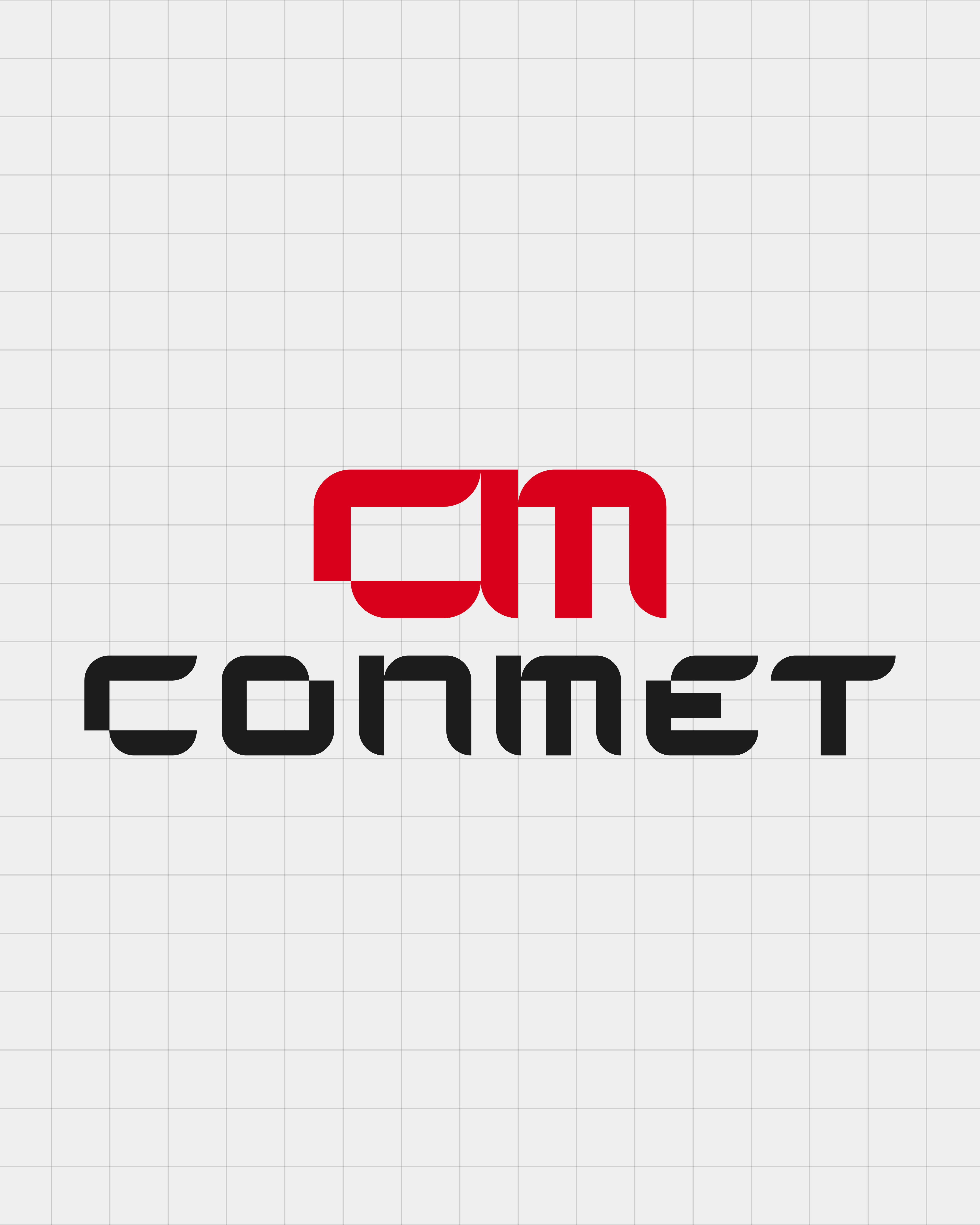
Conmet
Conmet
Conmet
2024
2024

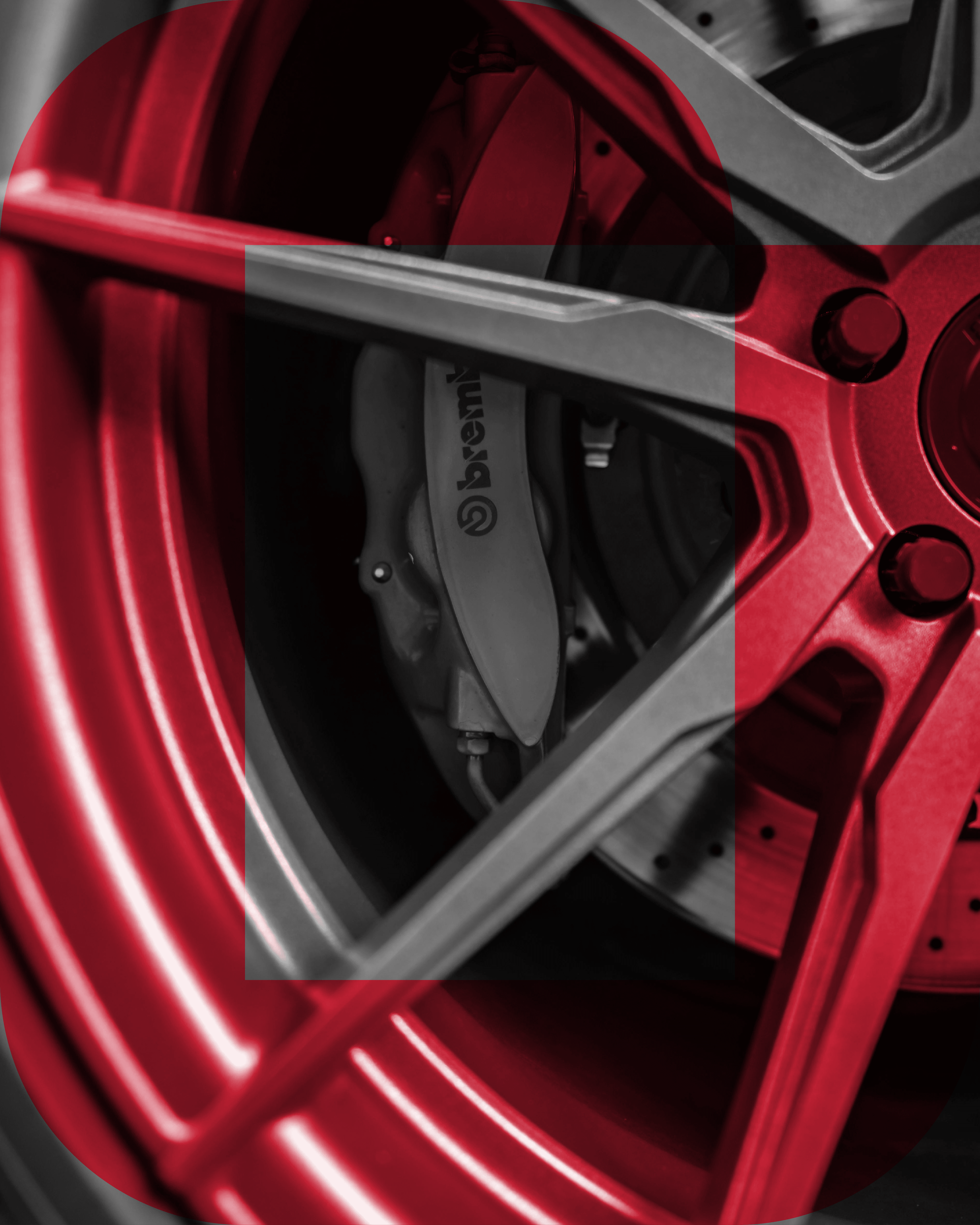
ConMet is a manufacturer specializing in automotive parts, with a focus on precision and performance. Their brand identity is built to reflect the exactness of their industry, balancing boldness with structure. Red, grey, white, and black were chosen as the primary palette to create a professional yet powerful visual system.
ConMet is a manufacturer specializing in automotive parts, with a focus on precision and performance. Their brand identity is built to reflect the exactness of their industry, balancing boldness with structure. Red, grey, white, and black were chosen as the primary palette to create a professional yet powerful visual system.
ConMet is a manufacturer specializing in automotive parts, with a focus on precision and performance. Their brand identity is built to reflect the exactness of their industry, balancing boldness with structure. Red, grey, white, and black were chosen as the primary palette to create a professional yet powerful visual system.
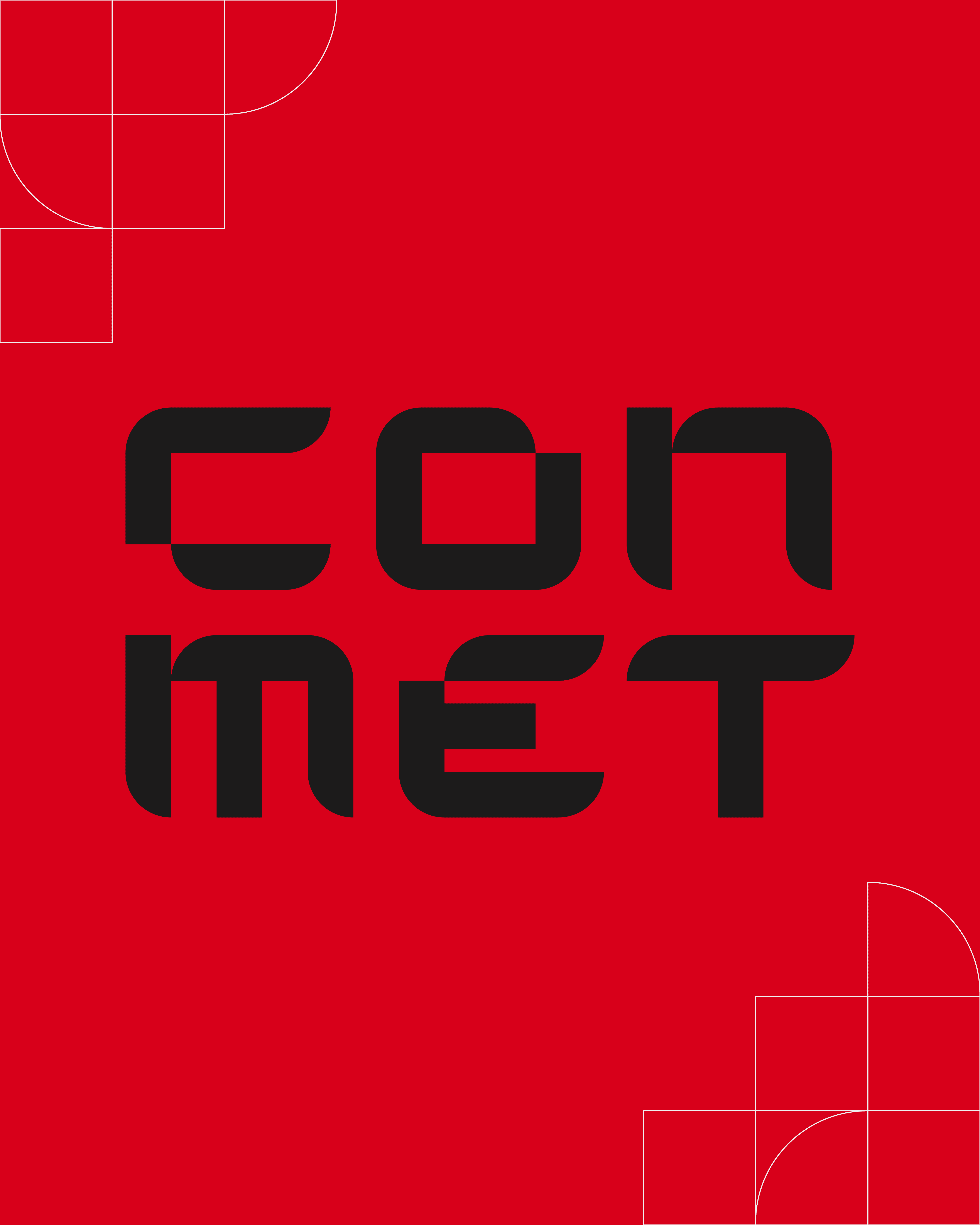
The logo design is constructed from rounded geometric forms, symbolizing the way parts are engineered to fit and function together. A strict grid system was applied to the logo, layouts, and marketing assets, ensuring that every piece of communication mirrored the mechanical precision at the heart of the brand. This consistency reinforced ConMet’s dedication to exactness and reliability.
The logo design is constructed from rounded geometric forms, symbolizing the way parts are engineered to fit and function together. A strict grid system was applied to the logo, layouts, and marketing assets, ensuring that every piece of communication mirrored the mechanical precision at the heart of the brand. This consistency reinforced ConMet’s dedication to exactness and reliability.
The logo design is constructed from rounded geometric forms, symbolizing the way parts are engineered to fit and function together. A strict grid system was applied to the logo, layouts, and marketing assets, ensuring that every piece of communication mirrored the mechanical precision at the heart of the brand. This consistency reinforced ConMet’s dedication to exactness and reliability.
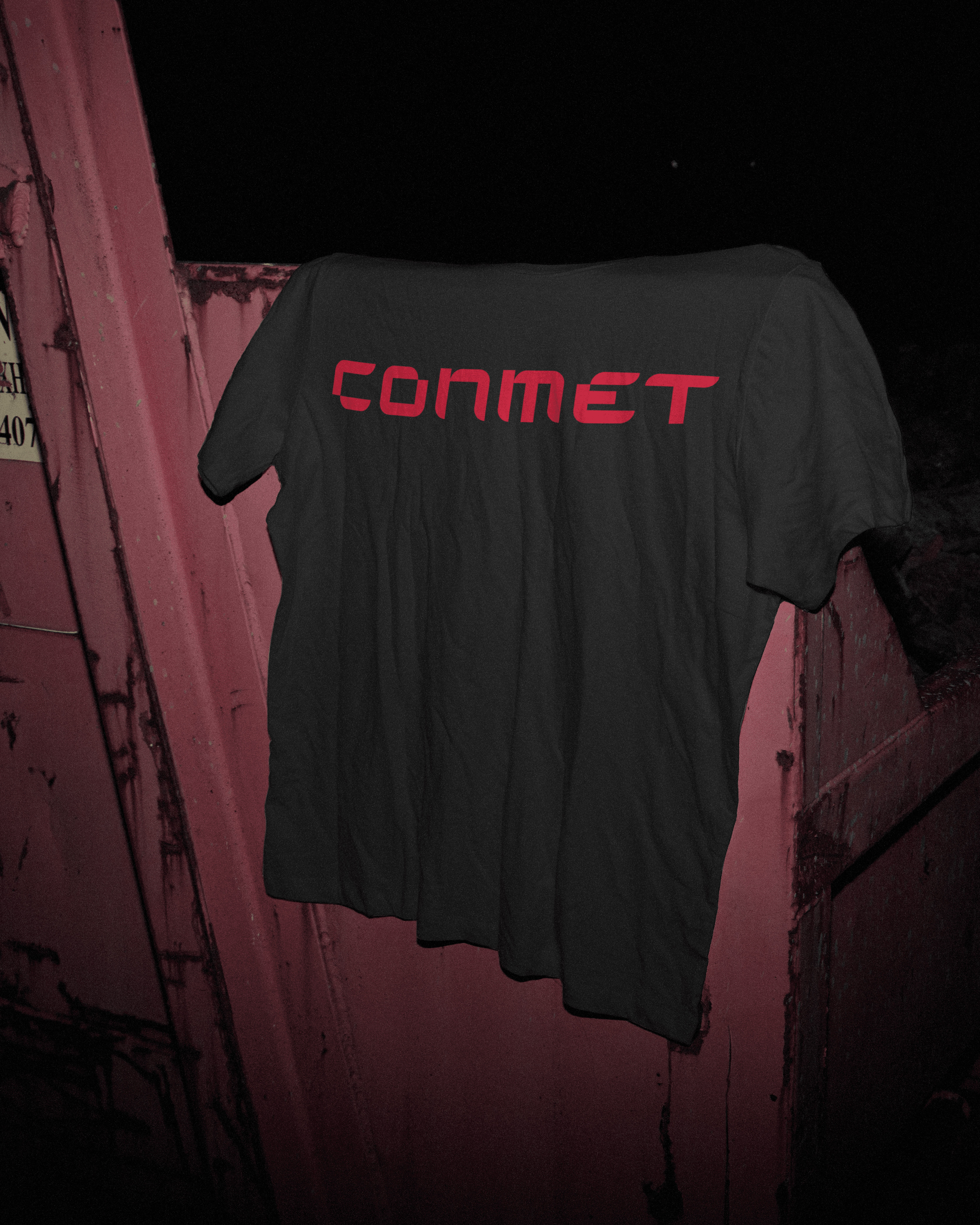
The result is a brand that feels both technical and strong. The grid-based identity provides a cohesive visual language across all applications, while the bold color palette communicates confidence and trust. ConMet’s branding positions them as a forward-looking manufacturer with the precision and clarity their industry demands.
The result is a brand that feels both technical and strong. The grid-based identity provides a cohesive visual language across all applications, while the bold color palette communicates confidence and trust. ConMet’s branding positions them as a forward-looking manufacturer with the precision and clarity their industry demands.
The result is a brand that feels both technical and strong. The grid-based identity provides a cohesive visual language across all applications, while the bold color palette communicates confidence and trust. ConMet’s branding positions them as a forward-looking manufacturer with the precision and clarity their industry demands.