SOS Staffing
SOS Staffing
SOS Staffing
2023
2023
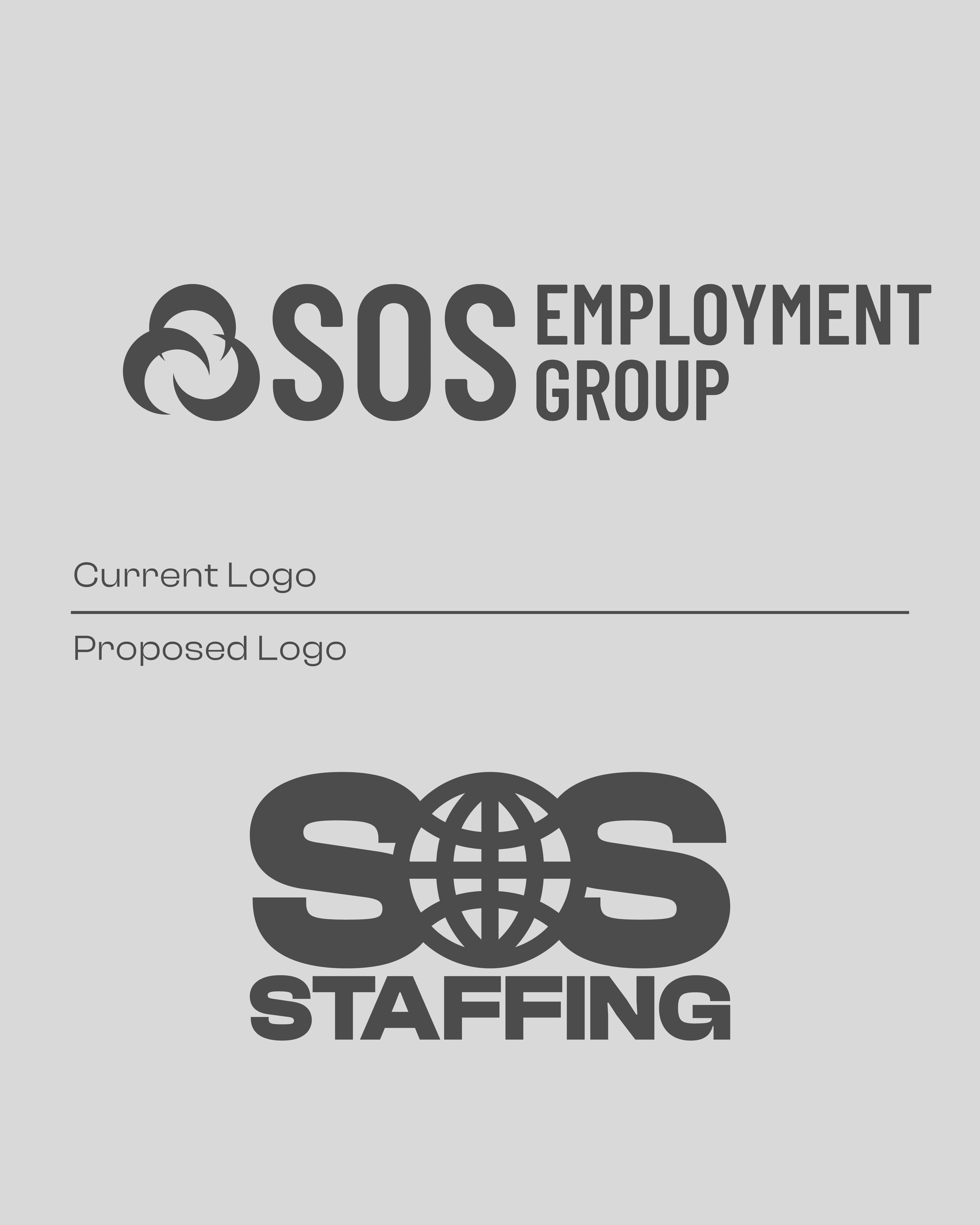
SOS Staffing was once a regional staffing agency that eventually disappeared due to a lack of brand direction and equity. Without a clear identity or audience focus, they were ultimately bought out to avoid further debt. My work for them was not commissioned, but rather a personal exercise in rethinking their brand.
SOS Staffing was once a regional staffing agency that eventually disappeared due to a lack of brand direction and equity. Without a clear identity or audience focus, they were ultimately bought out to avoid further debt. My work for them was not commissioned, but rather a personal exercise in rethinking their brand.
SOS Staffing was once a regional staffing agency that eventually disappeared due to a lack of brand direction and equity. Without a clear identity or audience focus, they were ultimately bought out to avoid further debt. My work for them was not commissioned, but rather a personal exercise in rethinking their brand.
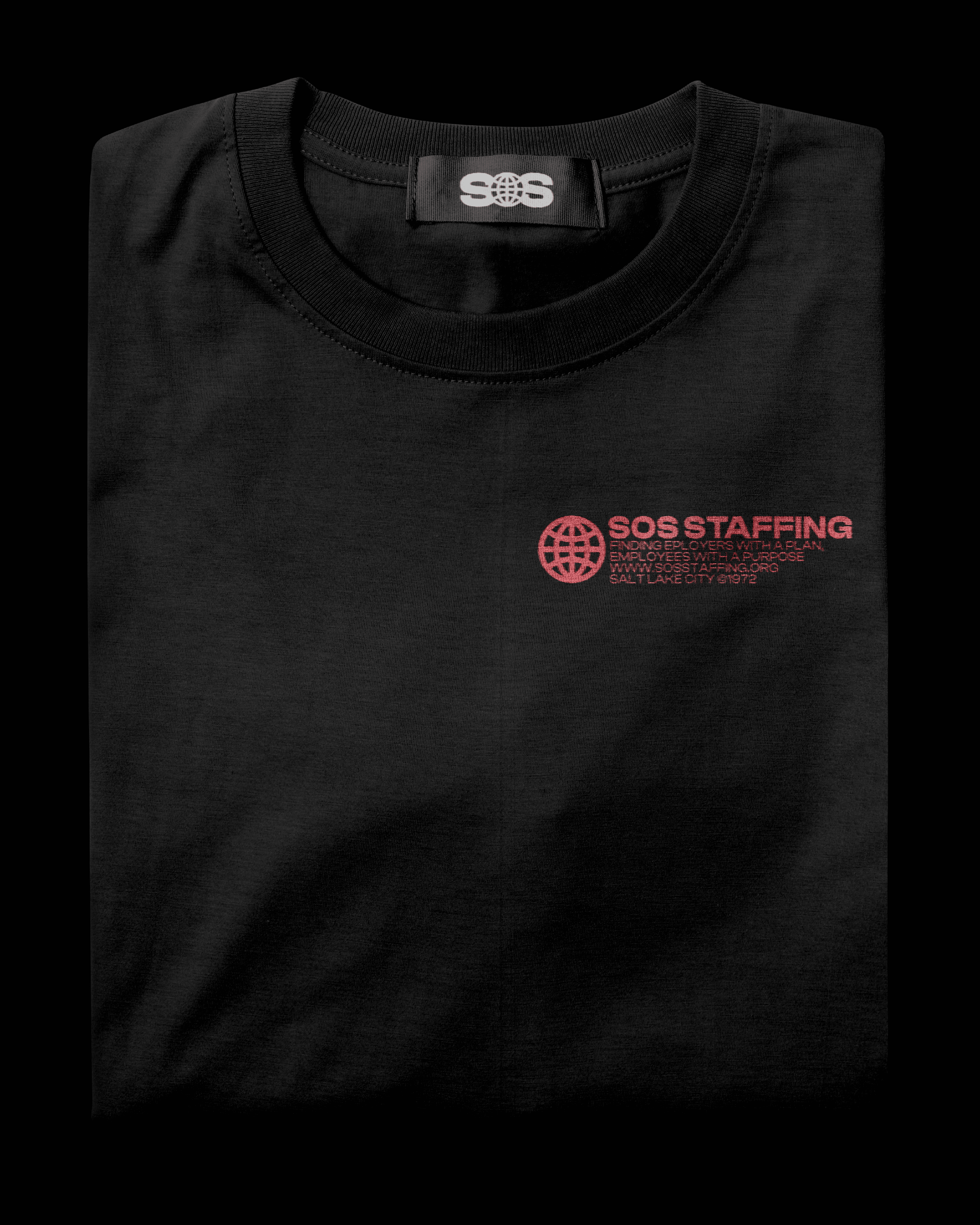
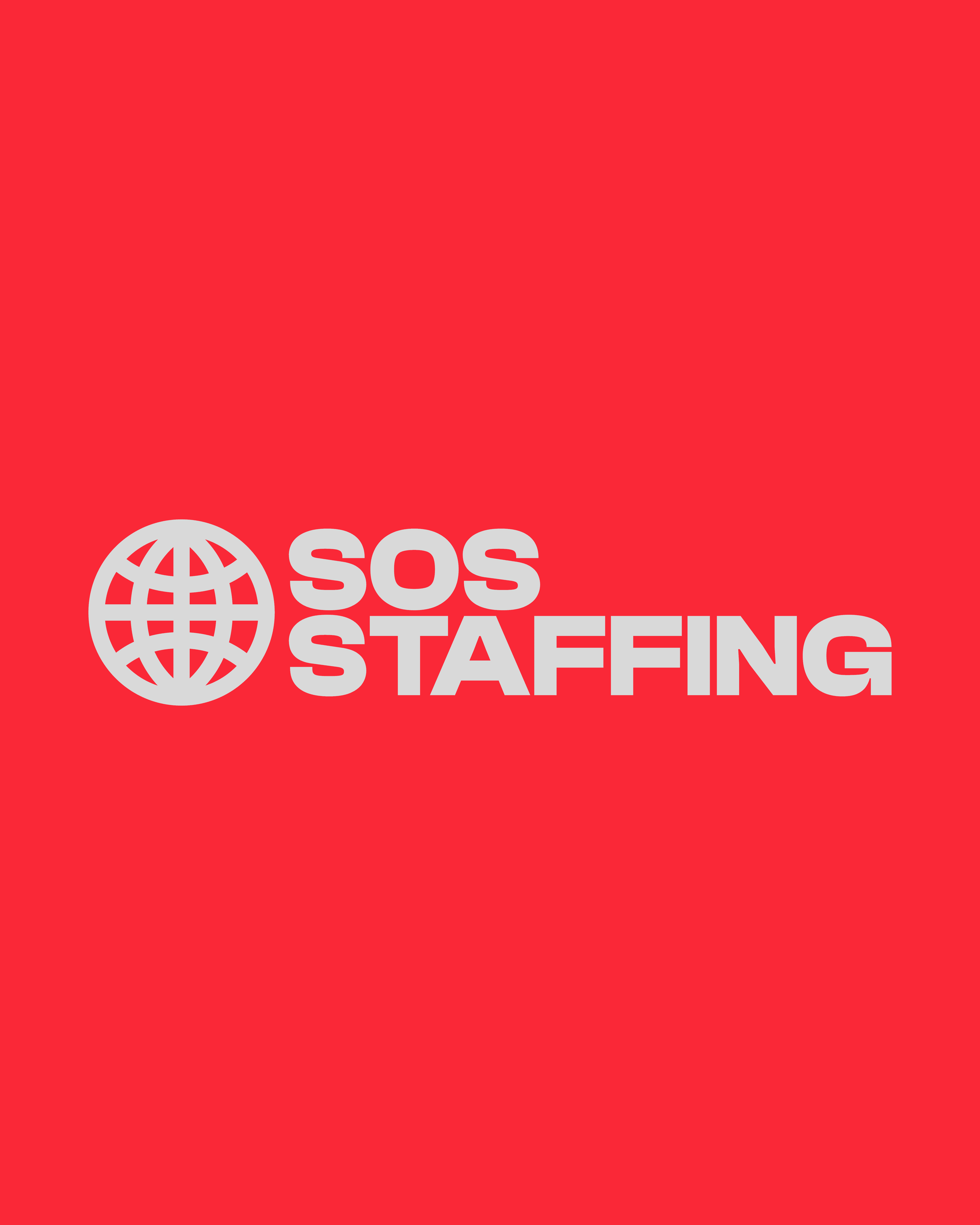
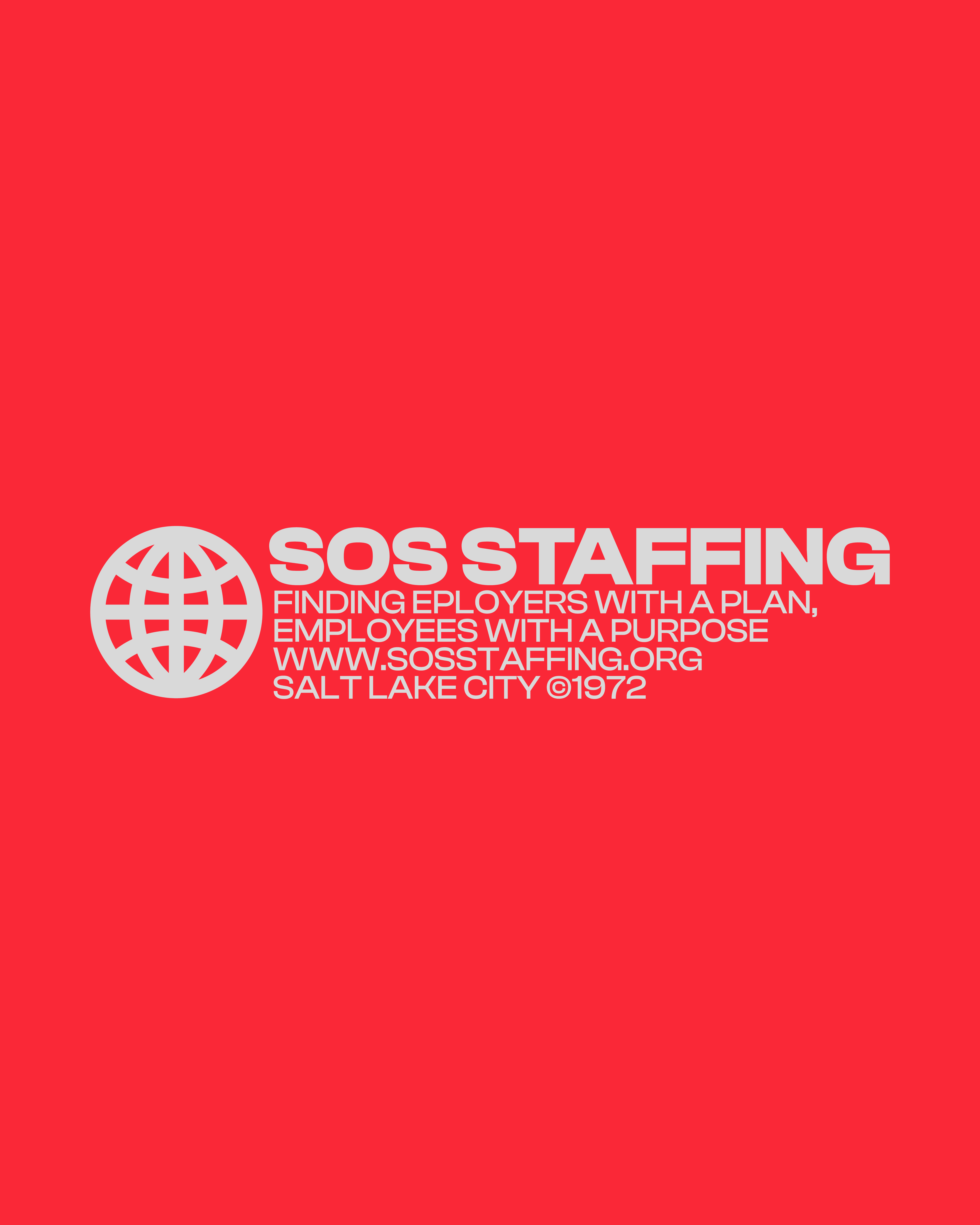
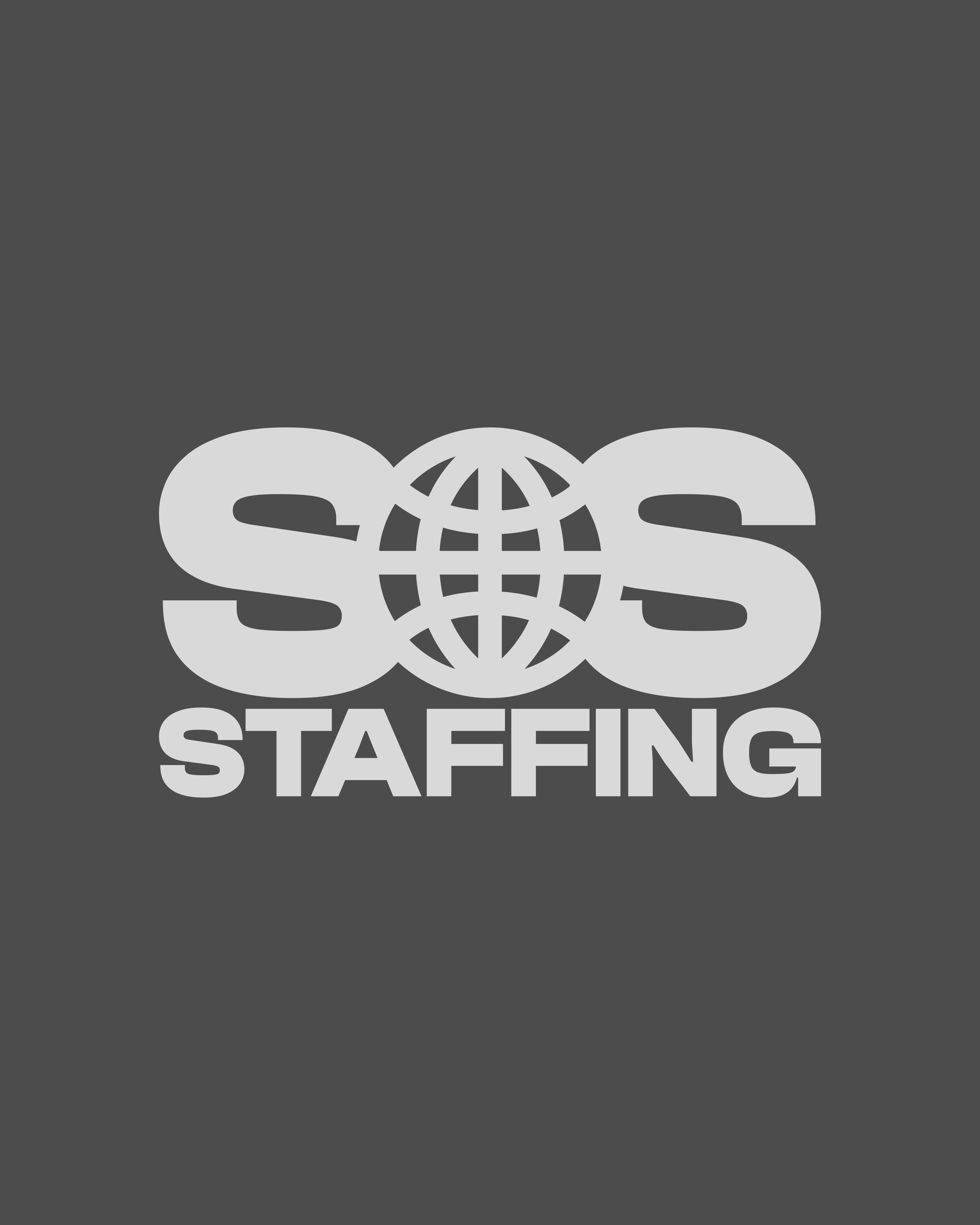
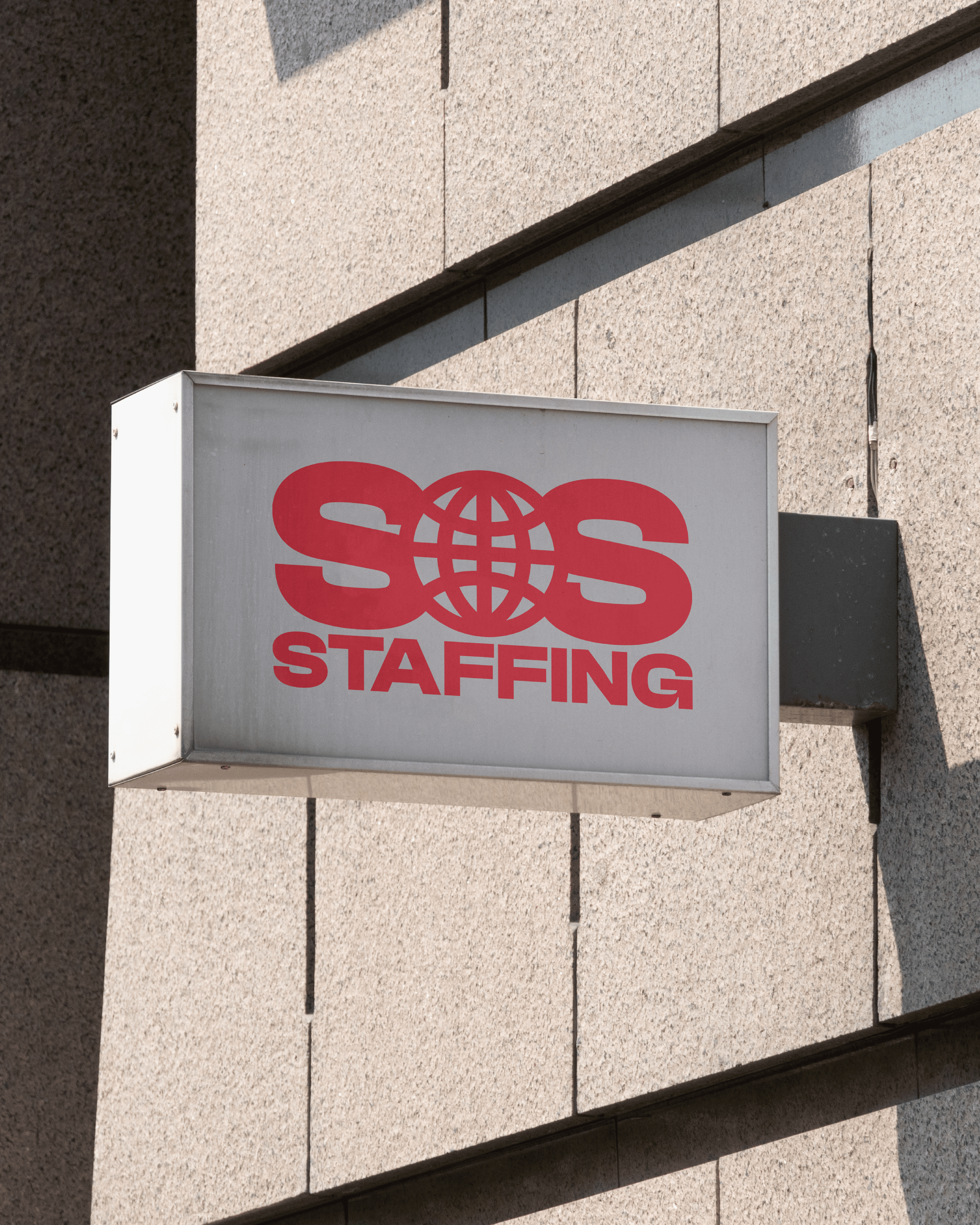
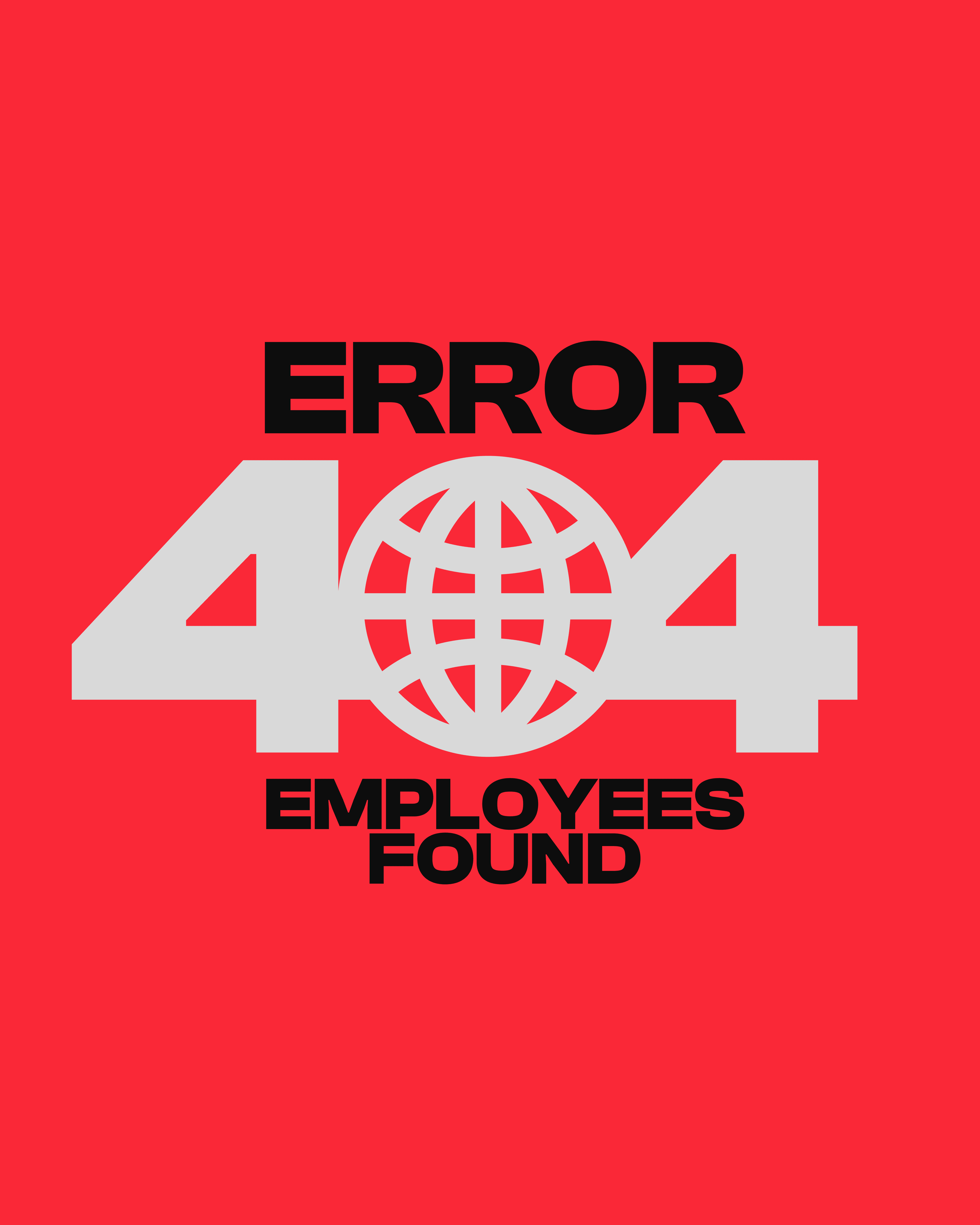
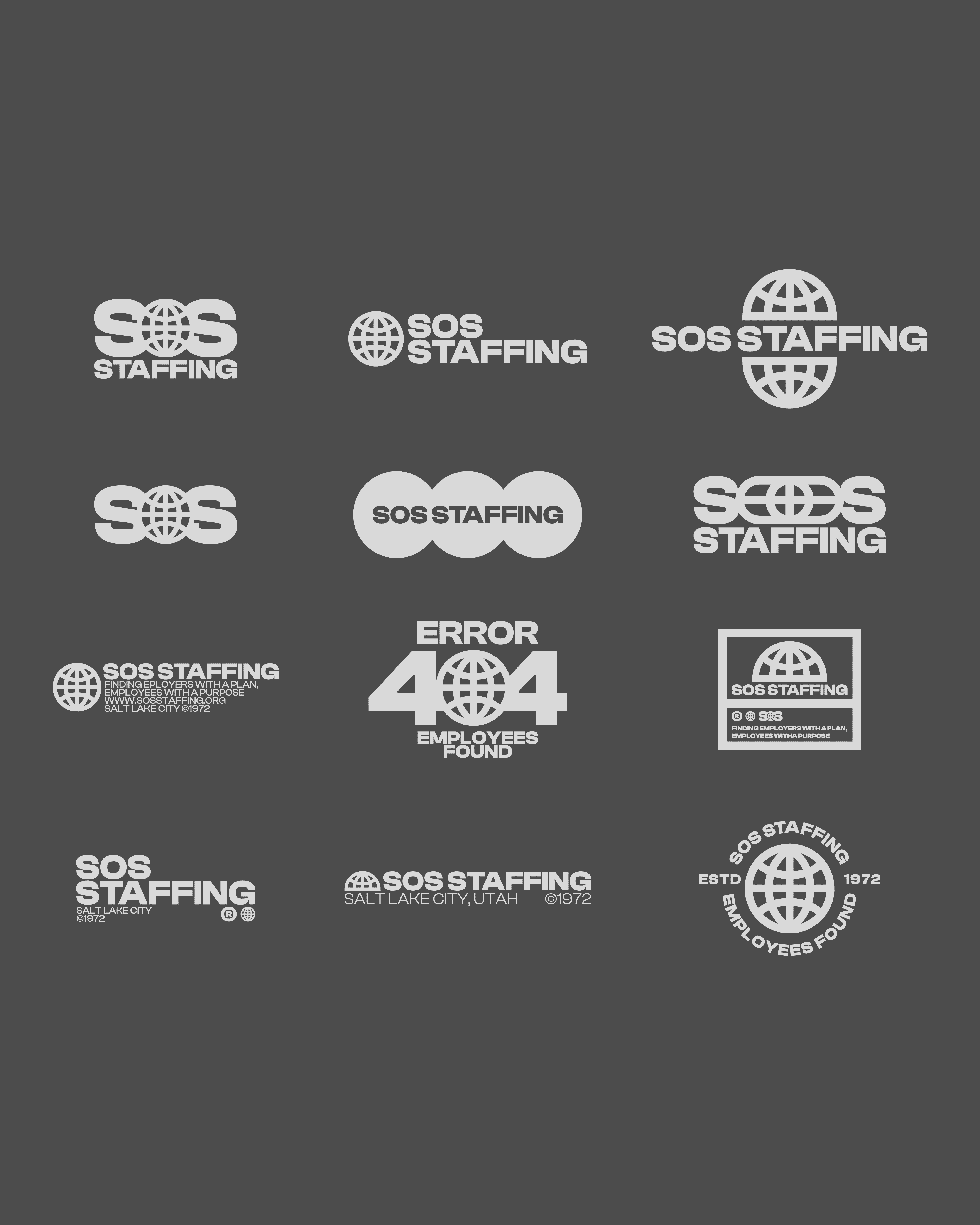
I developed an information-forward identity system using a black, grey, and red palette to create a sense of urgency and importance. The mark combined an “S–Globe–S” symbol with the word “Staffing” beneath, visually reinforcing their role in connecting people with work opportunities. The copy shifted to emphasize service to the individual, positioning SOS as an ally for job seekers rather than just a staffing company.
I developed an information-forward identity system using a black, grey, and red palette to create a sense of urgency and importance. The mark combined an “S–Globe–S” symbol with the word “Staffing” beneath, visually reinforcing their role in connecting people with work opportunities. The copy shifted to emphasize service to the individual, positioning SOS as an ally for job seekers rather than just a staffing company.
I developed an information-forward identity system using a black, grey, and red palette to create a sense of urgency and importance. The mark combined an “S–Globe–S” symbol with the word “Staffing” beneath, visually reinforcing their role in connecting people with work opportunities. The copy shifted to emphasize service to the individual, positioning SOS as an ally for job seekers rather than just a staffing company.
While the company itself no longer exists, the redesign served as a valuable exploration in repositioning a struggling brand. By elevating the visual presence and reframing the messaging, the identity demonstrated how clarity and focus could have offered SOS Staffing a stronger chance to remain relevant in their industry.
While the company itself no longer exists, the redesign served as a valuable exploration in repositioning a struggling brand. By elevating the visual presence and reframing the messaging, the identity demonstrated how clarity and focus could have offered SOS Staffing a stronger chance to remain relevant in their industry.
While the company itself no longer exists, the redesign served as a valuable exploration in repositioning a struggling brand. By elevating the visual presence and reframing the messaging, the identity demonstrated how clarity and focus could have offered SOS Staffing a stronger chance to remain relevant in their industry.