
The Perfect Time to Start
A Journey of a Thousand Miles
The Perfect Time to Start
The Perfect Time to Start
Perfection is a trap.
If you wait for the perfect idea, the perfect moment, or the perfect execution, you’ll never launch. The best brands, businesses, and creatives understand that momentum is more valuable than hesitation. And no franchise has embodied this more than the Utah Jazz, and with their season starting tomorrow, I thought now would be a great time to talk about them.
As a resident of Utah, I’ve had a front row seat at their branding attempts. It has been a masterclass in iteration; loved, hated, debated, but always evolving.
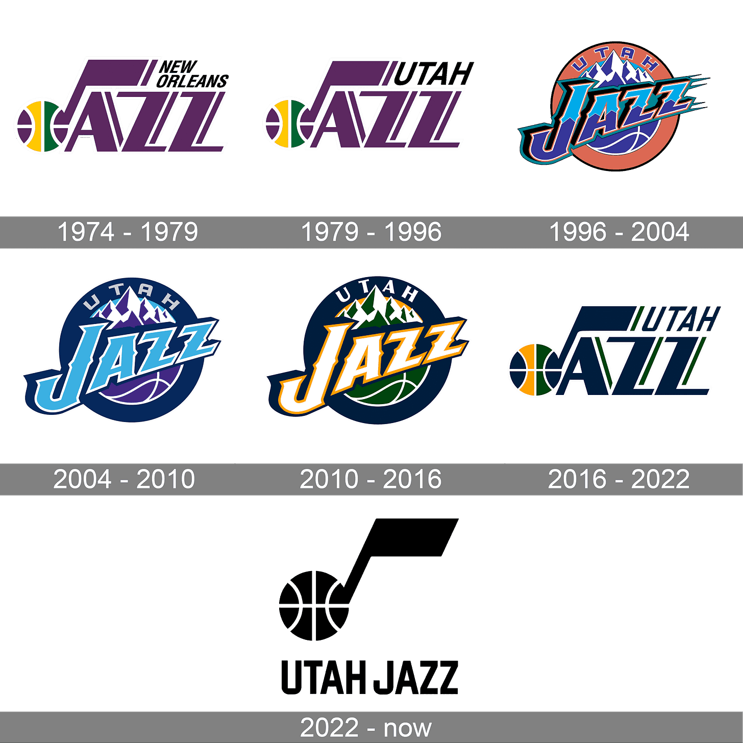
From the iconic mountain design of the '90s to the polarizing highlighter yellow era of 2022, the Jazz have never been afraid to start, pivot, and refine. Now, as they lean back into the “Mountain Basketball” aesthetic, it’s clear that action and adaptation, not perfection, have been the key to their identity.
A Journey Through Change
In the early ‘90s, Tom O’Grady, the NBA’s creative director at the time, was tasked with reimagining the Utah Jazz’s look. His inspiration came straight from Utah’s landscape:
“I remember flying into Salt Lake City and seeing the Wasatch Mountains in the distance. It was late afternoon, and I was so impressed by their colors and the beauty of the Wasatch Mountains.”
From that moment, the iconic mountain design was born. The light blue came from the Park City slopes, the copper ring from the Kennecott Copper Mine, every element was deeply tied to Utah. The design was bold, different, and risky. And not everyone loved it.


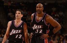
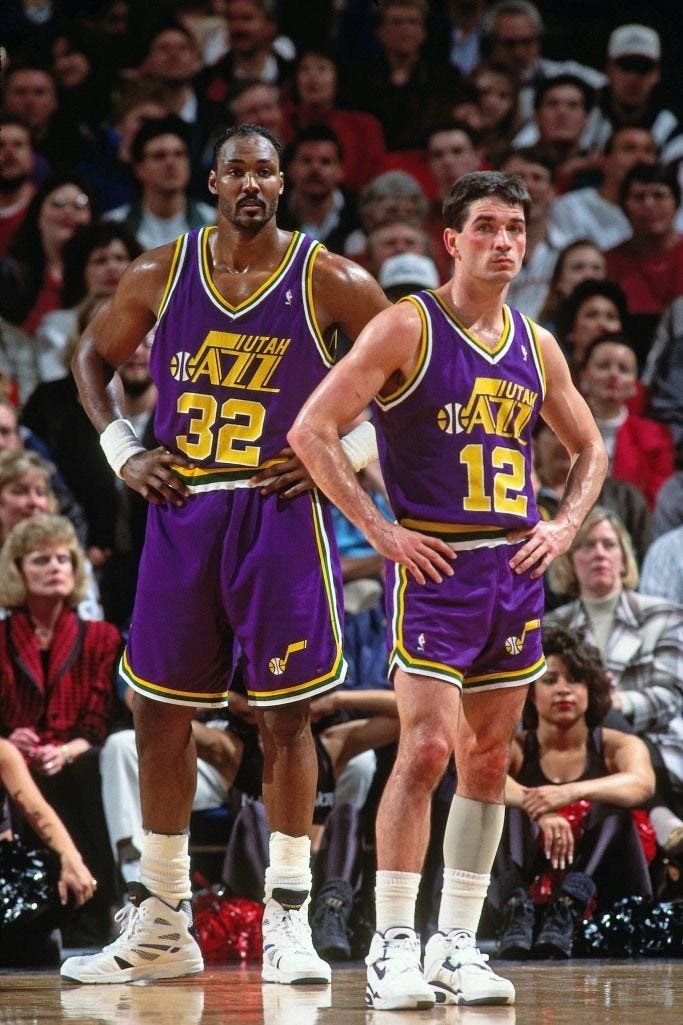
John Stockton and Karl Malone wore a variety of jerseys during their tenure with the Utah Jazz.
Even John Stockton wasn’t on board when ownership proposed a rebrand in the mid-’90s.
“I said, Nope. The Yankees don’t change logos. That was my attitude.”
But despite the skepticism, the Jazz moved forward. And in time, that mountain design became legendary, representing an era of NBA greatness with Stockton and Malone leading the charge. However, each decade it seemed that the logo stayed the same, but the color palette changed and the jerseys changed, all while it seemed that the Jazz didn’t truly know what their identity was. Were they a relocated team from New Orleans or were they a new scrappy team trying to dominate the small market scene?


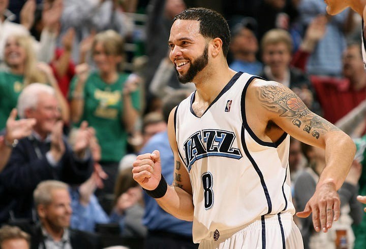

Utah Jazz Jerseys and Branding before 2010
The Backlash and the Pivot
Fast forward to 2010. The Jazz abandoned the mountains and returned to their original music note-inspired design. The goal? Finding a way to find their identity while updating their visual identity in a way that compliments both the rich history of the Team and the current location of the Team and its fans.



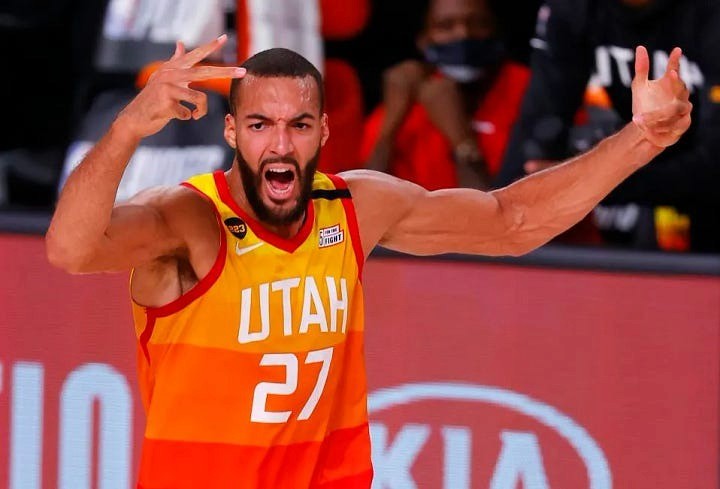
Utah Jazz Jerseys and Branding after 2010
“Our existing logos were a little bit stale.”
–Then-CEO Greg Miller
Fans had mixed reactions. Some appreciated the homage to history; others missed the mountains. But the biggest controversy came in 2022, when the team introduced a radical shift, black and white jerseys with electric yellow. It was minimal, modern, and, to many, soulless.


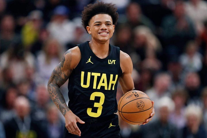

The Most Radical Utah Jazz Rebrand
“This uniform collection features the return of our cornerstone color purple… but these fresh yet familiar looks speak to our great history and dynamic future.”
–Jazz President Jim Olson
The response? Overwhelmingly negative. Fans wanted more personality, more Utah, more connection to the past. And so, just two seasons later, the Jazz pivoted again.
The Mountain Returns
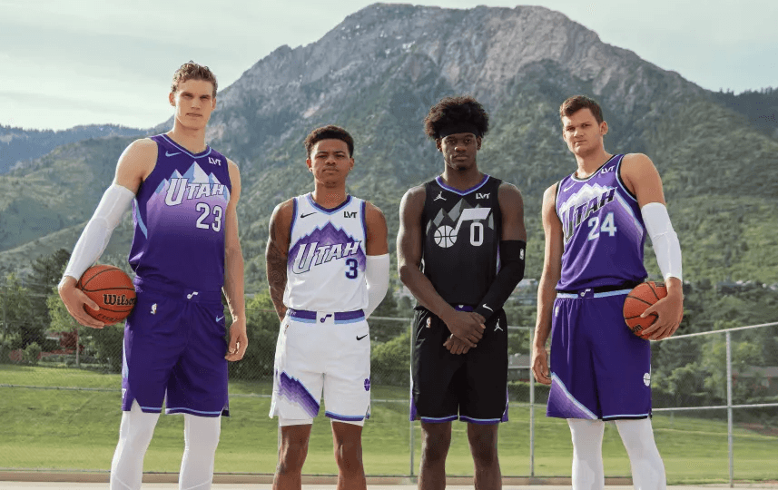
The team has now fully embraced what fans have been demanding for years, bringing back the mountain aesthetic with modern refinements. Working with design firm Doubleday & Cartwright and Nike, they’ve introduced Mountain Purple, Midnight Black, and Sky Blue, a blend of nostalgia and evolution.
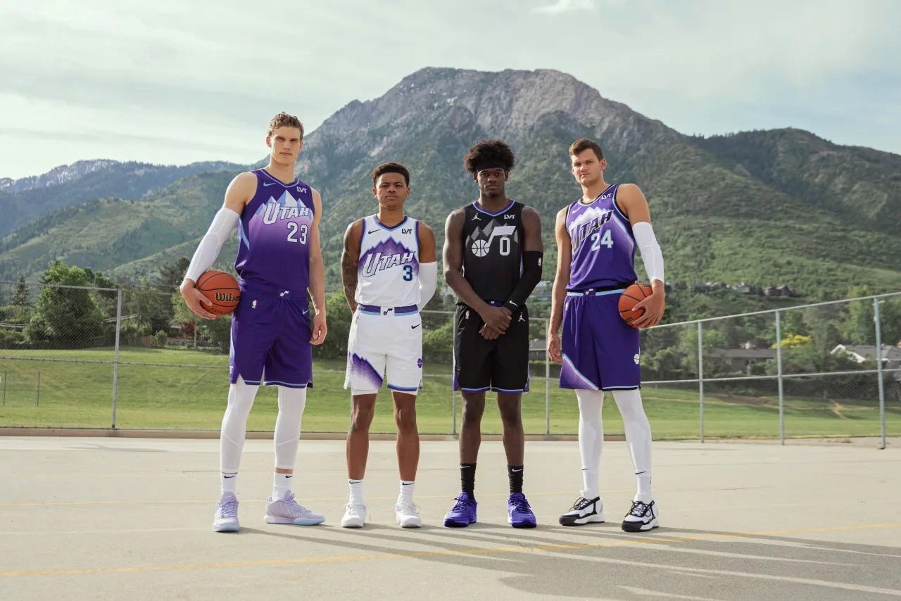
“We know the purple pops. It’s how a lot of people know us.”
–Jazz Governor Ryan Smith
This isn’t just a rehash of the past. The new designs incorporate elements from various Jazz eras, including subtle nods that many dedicated and lifelong fans will see and recognize. The Jazz have been a brand that has constantly been iterating, refining, and adjusting until they find what fits them. I believe they have found it.
What this Means for Creatives
The Jazz’s branding evolution is a lesson for anyone in design, marketing, or business. They didn’t wait for perfection. They made a move, listened, adapted, and moved again. That’s the blueprint for success.
Too many creatives hesitate, tweaking and refining endlessly, fearing criticism. But the truth is, you’ll never get it perfect on the first try. The only way to know what works is to put it out there.
Test. Learn. Pivot.
So, whether you’re launching a brand, designing a logo, or building something new, don’t get stuck chasing perfection.
Start. Adapt. Move forward.
Because in the end, done is always better than perfect.
Perfection is a trap.
If you wait for the perfect idea, the perfect moment, or the perfect execution, you’ll never launch. The best brands, businesses, and creatives understand that momentum is more valuable than hesitation. And no franchise has embodied this more than the Utah Jazz, and with their season starting tomorrow, I thought now would be a great time to talk about them.
As a resident of Utah, I’ve had a front row seat at their branding attempts. It has been a masterclass in iteration; loved, hated, debated, but always evolving.
From the iconic mountain design of the '90s to the polarizing highlighter yellow era of 2022, the Jazz have never been afraid to start, pivot, and refine. Now, as they lean back into the “Mountain Basketball” aesthetic, it’s clear that action and adaptation, not perfection, have been the key to their identity.
A Journey Through Change
In the early ‘90s, Tom O’Grady, the NBA’s creative director at the time, was tasked with reimagining the Utah Jazz’s look. His inspiration came straight from Utah’s landscape:
“I remember flying into Salt Lake City and seeing the Wasatch Mountains in the distance. It was late afternoon, and I was so impressed by their colors and the beauty of the Wasatch Mountains.”
From that moment, the iconic mountain design was born. The light blue came from the Park City slopes, the copper ring from the Kennecott Copper Mine, every element was deeply tied to Utah. The design was bold, different, and risky. And not everyone loved it.
John Stockton and Karl Malone wore a variety of jerseys during their tenure with the Utah Jazz.
Even John Stockton wasn’t on board when ownership proposed a rebrand in the mid-’90s.
“I said, Nope. The Yankees don’t change logos. That was my attitude.”
But despite the skepticism, the Jazz moved forward. And in time, that mountain design became legendary, representing an era of NBA greatness with Stockton and Malone leading the charge. However, each decade it seemed that the logo stayed the same, but the color palette changed and the jerseys changed, all while it seemed that the Jazz didn’t truly know what their identity was. Were they a relocated team from New Orleans or were they a new scrappy team trying to dominate the small market scene?
Utah Jazz Jerseys and Branding before 2010
The Backlash and the Pivot
Fast forward to 2010. The Jazz abandoned the mountains and returned to their original music note-inspired design. The goal? Finding a way to find their identity while updating their visual identity in a way that compliments both the rich history of the Team and the current location of the Team and its fans.
Utah Jazz Jerseys and Branding after 2010
“Our existing logos were a little bit stale.”
–Then-CEO Greg Miller
Fans had mixed reactions. Some appreciated the homage to history; others missed the mountains. But the biggest controversy came in 2022, when the team introduced a radical shift, black and white jerseys with electric yellow. It was minimal, modern, and, to many, soulless.
The Most Radical Utah Jazz Rebrand
“This uniform collection features the return of our cornerstone color purple… but these fresh yet familiar looks speak to our great history and dynamic future.”
–Jazz President Jim Olson
The response? Overwhelmingly negative. Fans wanted more personality, more Utah, more connection to the past. And so, just two seasons later, the Jazz pivoted again.
The Mountain Returns
The team has now fully embraced what fans have been demanding for years, bringing back the mountain aesthetic with modern refinements. Working with design firm Doubleday & Cartwright and Nike, they’ve introduced Mountain Purple, Midnight Black, and Sky Blue, a blend of nostalgia and evolution.
“We know the purple pops. It’s how a lot of people know us.”
–Jazz Governor Ryan Smith
This isn’t just a rehash of the past. The new designs incorporate elements from various Jazz eras, including subtle nods that many dedicated and lifelong fans will see and recognize. The Jazz have been a brand that has constantly been iterating, refining, and adjusting until they find what fits them. I believe they have found it.
What this Means for Creatives
The Jazz’s branding evolution is a lesson for anyone in design, marketing, or business. They didn’t wait for perfection. They made a move, listened, adapted, and moved again. That’s the blueprint for success.
Too many creatives hesitate, tweaking and refining endlessly, fearing criticism. But the truth is, you’ll never get it perfect on the first try. The only way to know what works is to put it out there.
Test. Learn. Pivot.
So, whether you’re launching a brand, designing a logo, or building something new, don’t get stuck chasing perfection.
Start. Adapt. Move forward.
Because in the end, done is always better than perfect.