Triton
Triton
Triton
2024
2024
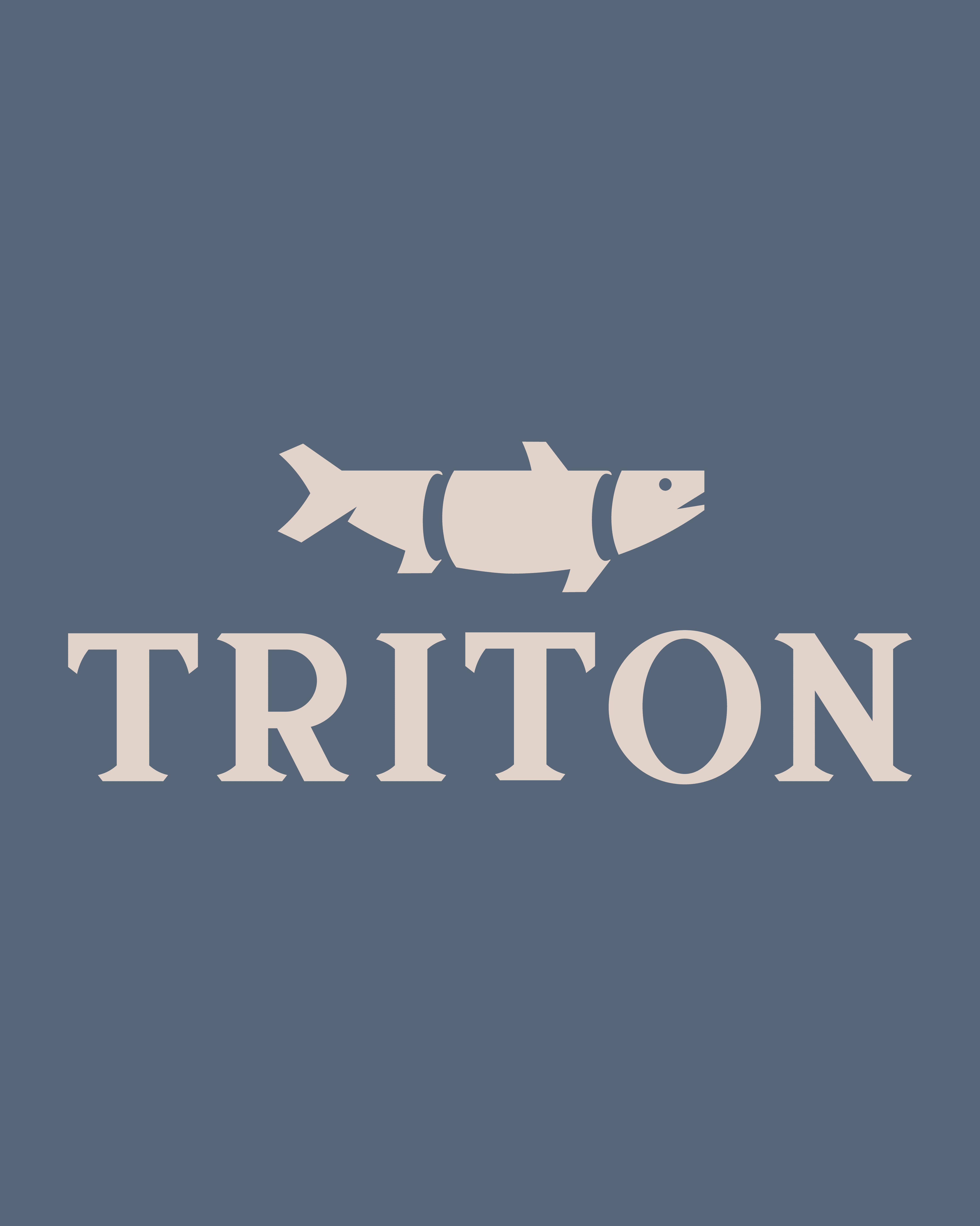

Triton is a school project centered on a fresh, never-frozen seafood brand inspired by the Mediterranean coast. The brand focuses on quality, freshness, and a contemporary, geometric approach to seafood branding.
Triton is a school project centered on a fresh, never-frozen seafood brand inspired by the Mediterranean coast. The brand focuses on quality, freshness, and a contemporary, geometric approach to seafood branding.
Triton is a school project centered on a fresh, never-frozen seafood brand inspired by the Mediterranean coast. The brand focuses on quality, freshness, and a contemporary, geometric approach to seafood branding.
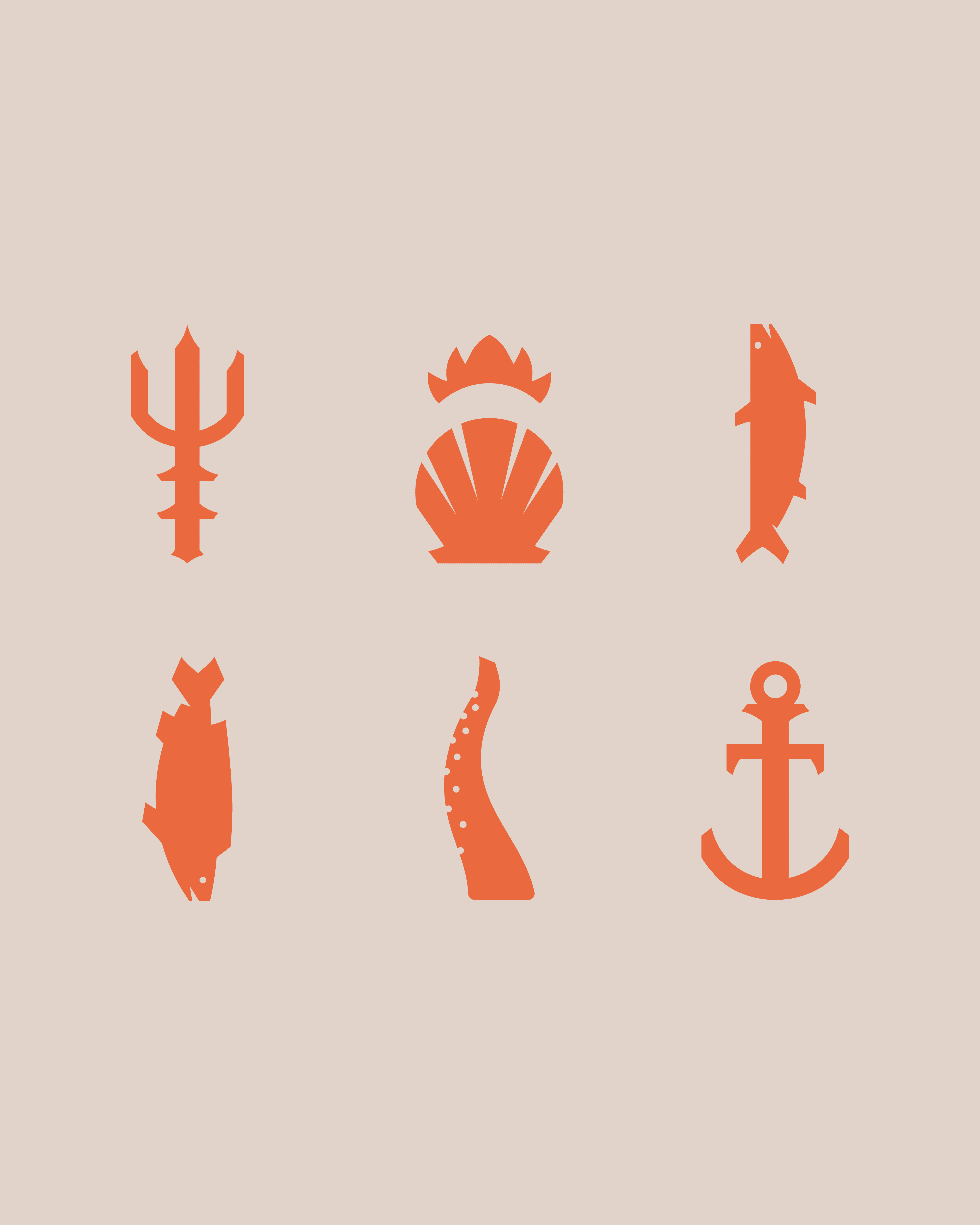
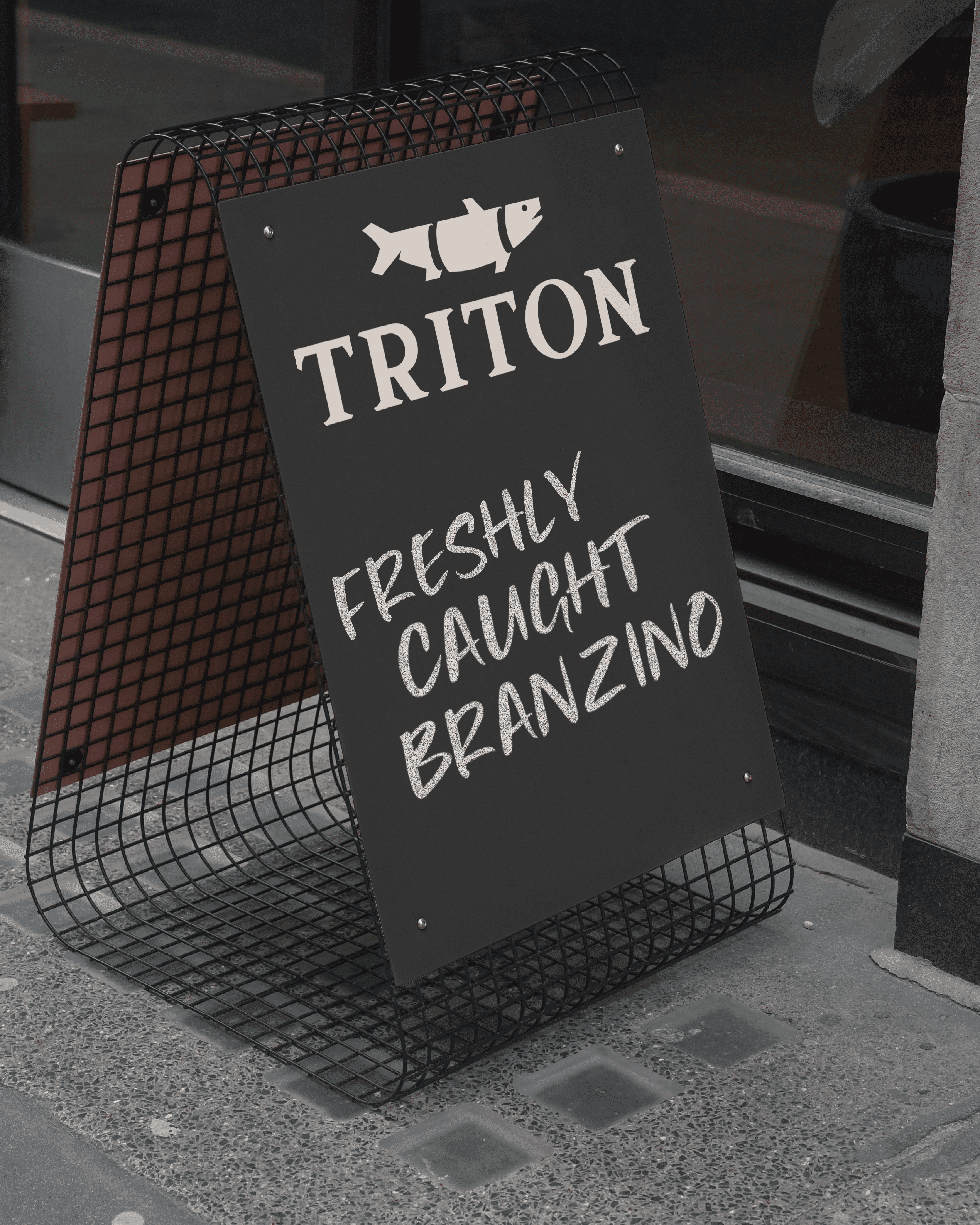
The icon is a geometric fish segmented into three pieces, establishing a modular system. This approach extends across the brand, using similar shapes, angles, and points to create additional fish and supporting icons. The color palette—primarily blue, orange, and green—evokes the sea, freshness, and natural ingredients, while additional colors are used sparingly to support versatility.
The icon is a geometric fish segmented into three pieces, establishing a modular system. This approach extends across the brand, using similar shapes, angles, and points to create additional fish and supporting icons. The color palette—primarily blue, orange, and green—evokes the sea, freshness, and natural ingredients, while additional colors are used sparingly to support versatility.
The icon is a geometric fish segmented into three pieces, establishing a modular system. This approach extends across the brand, using similar shapes, angles, and points to create additional fish and supporting icons. The color palette—primarily blue, orange, and green—evokes the sea, freshness, and natural ingredients, while additional colors are used sparingly to support versatility.


The resulting identity feels clean, modern, and visually cohesive, reflecting the brand’s commitment to fresh seafood. Through modular iconography and a consistent color system, Triton communicates quality and approachability while visually connecting to its Mediterranean roots.
The resulting identity feels clean, modern, and visually cohesive, reflecting the brand’s commitment to fresh seafood. Through modular iconography and a consistent color system, Triton communicates quality and approachability while visually connecting to its Mediterranean roots.
The resulting identity feels clean, modern, and visually cohesive, reflecting the brand’s commitment to fresh seafood. Through modular iconography and a consistent color system, Triton communicates quality and approachability while visually connecting to its Mediterranean roots.