Pretty Dope
Pretty Dope
Pretty Dope
2024
2024

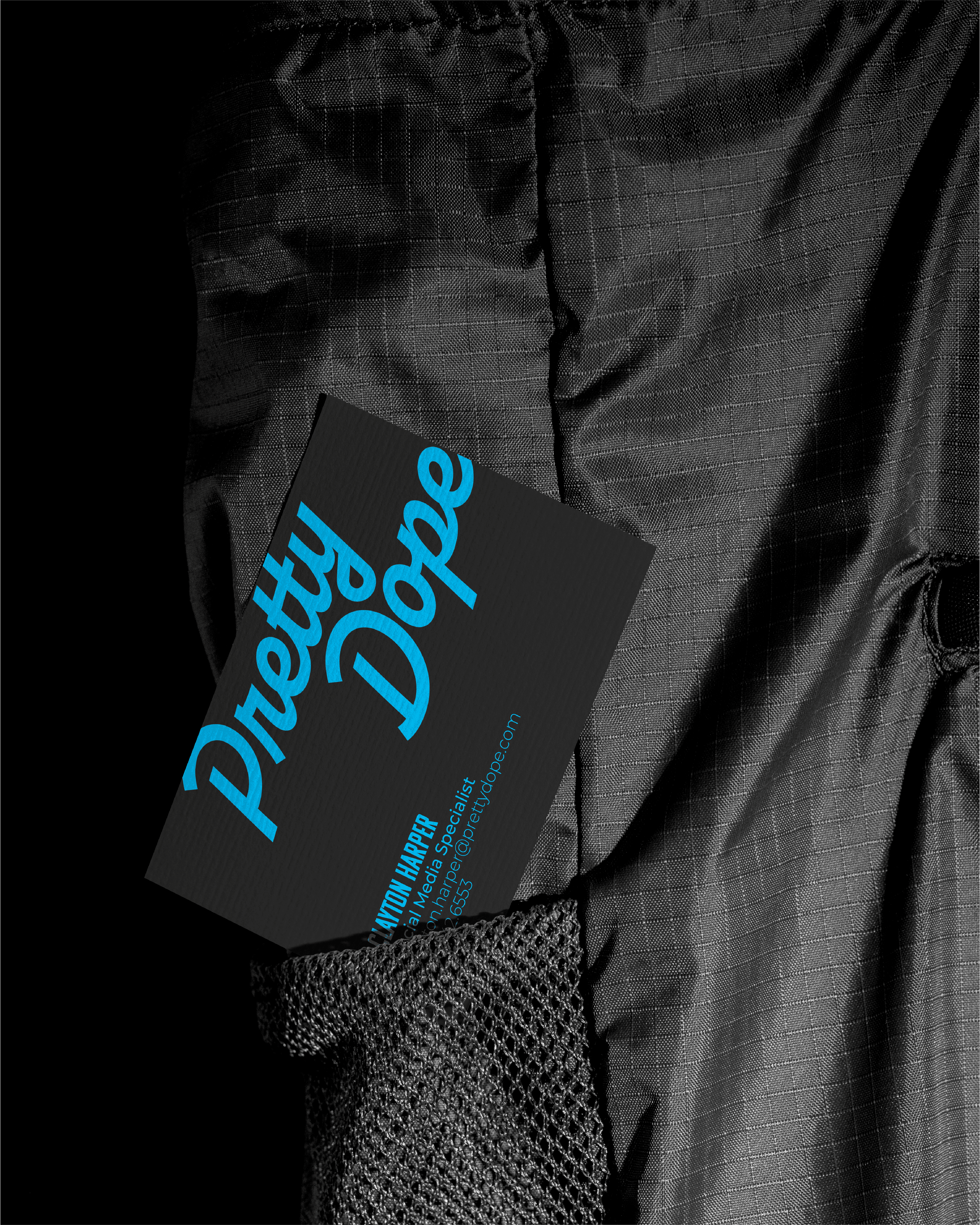
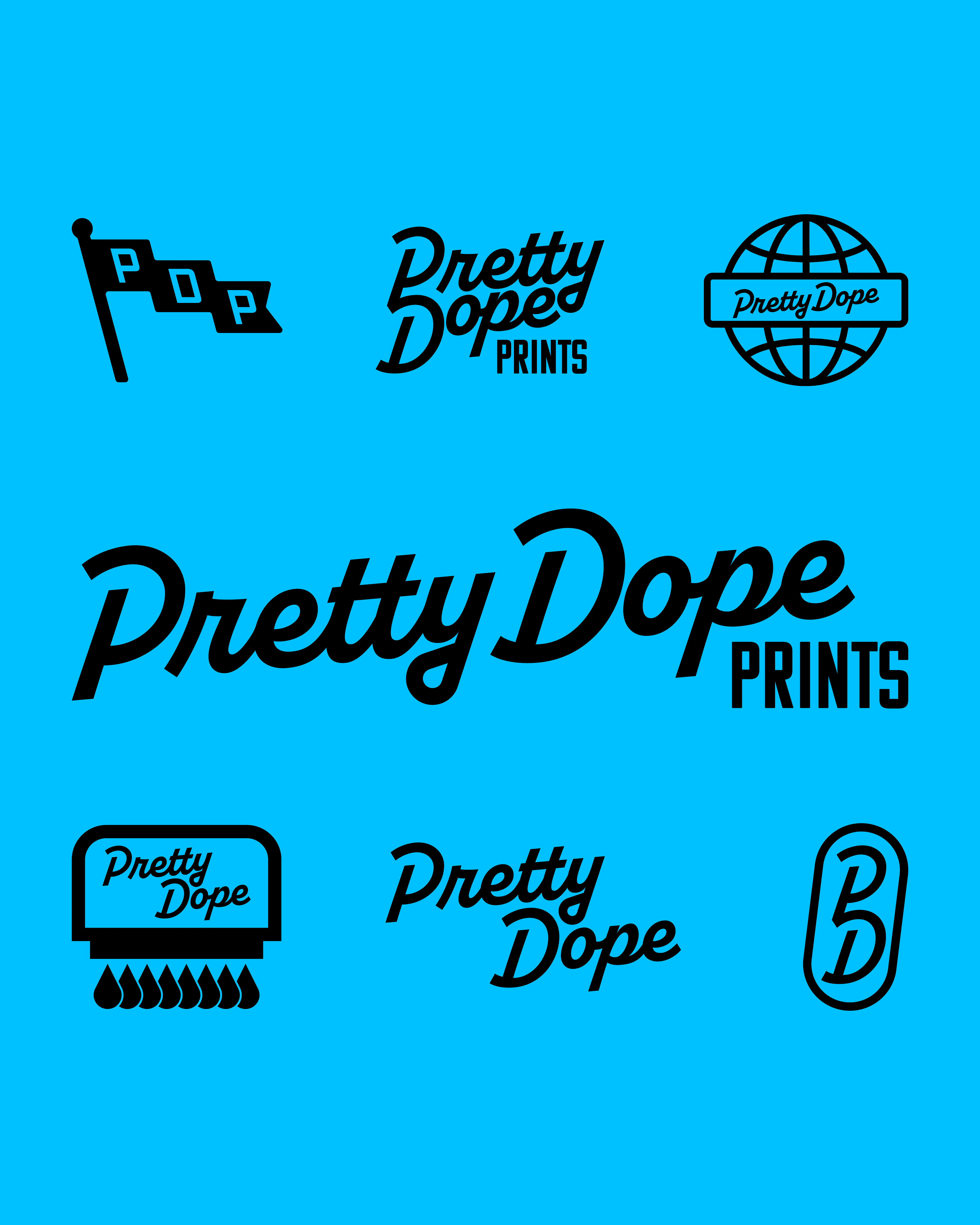
Pretty Dope Prints is a print and embroidery shop based in Logan, Utah. The brand needed a fresh, modern identity that communicated creativity and professionalism while remaining approachable to a wide audience.
Pretty Dope Prints is a print and embroidery shop based in Logan, Utah. The brand needed a fresh, modern identity that communicated creativity and professionalism while remaining approachable to a wide audience.
Pretty Dope Prints is a print and embroidery shop based in Logan, Utah. The brand needed a fresh, modern identity that communicated creativity and professionalism while remaining approachable to a wide audience.
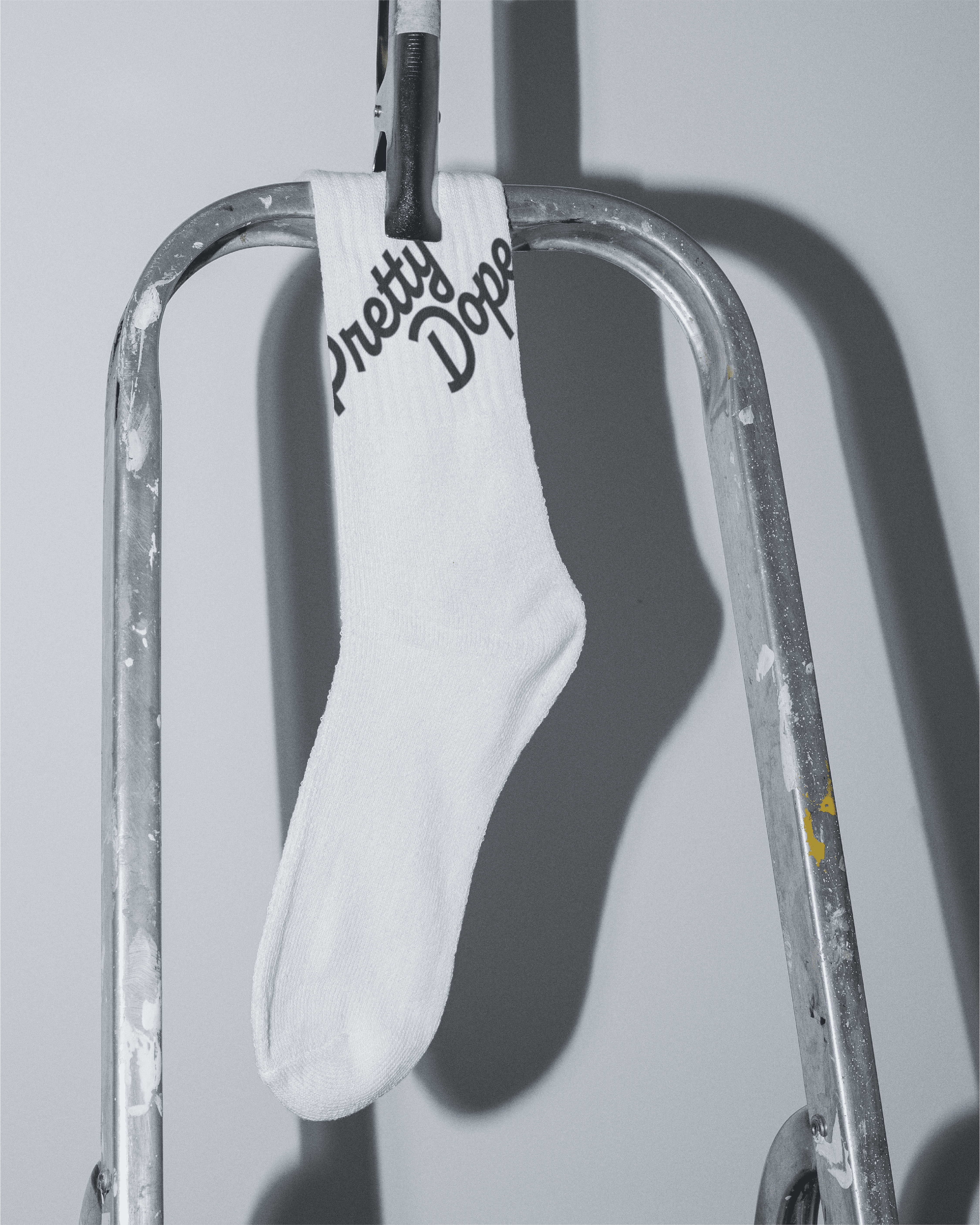

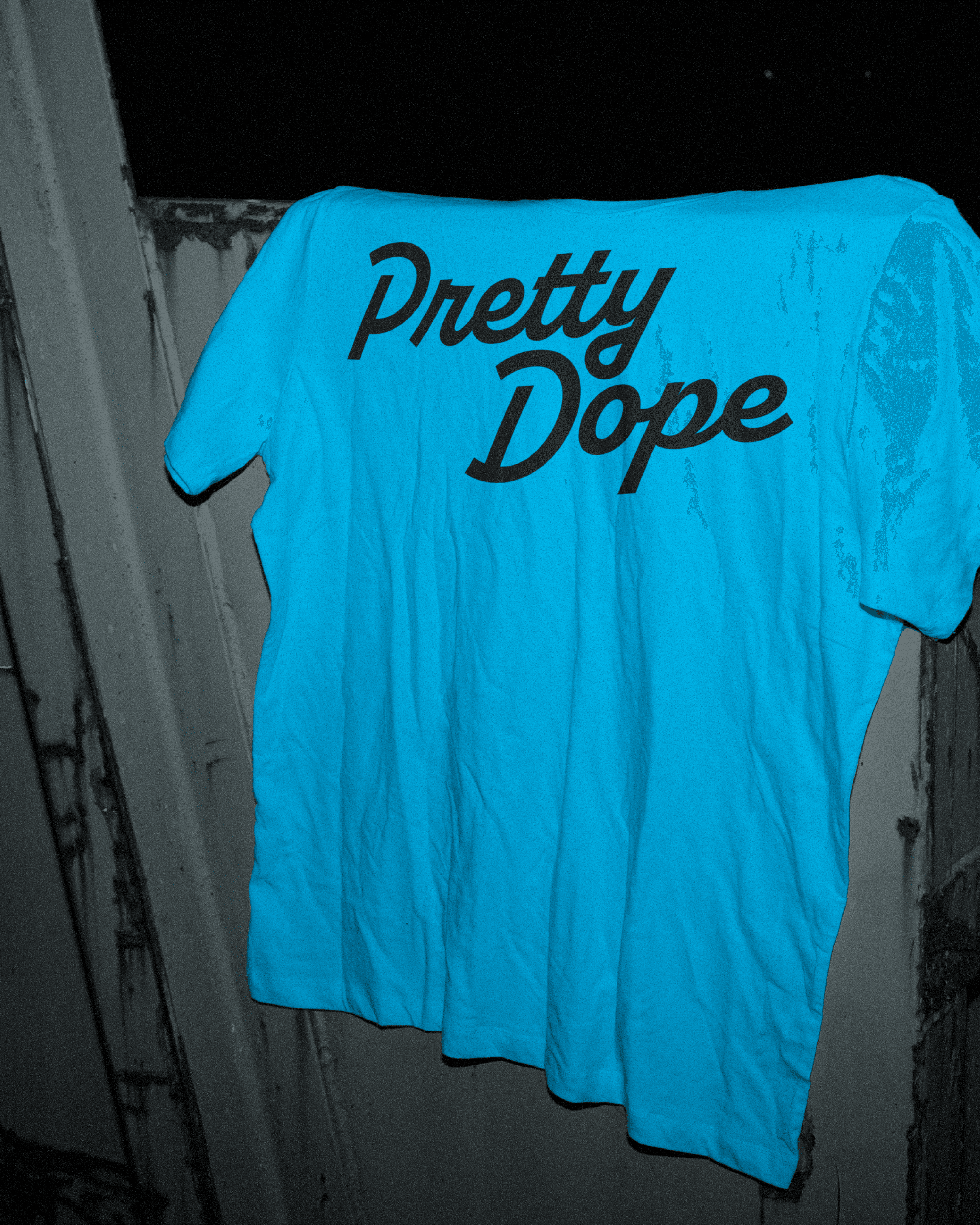
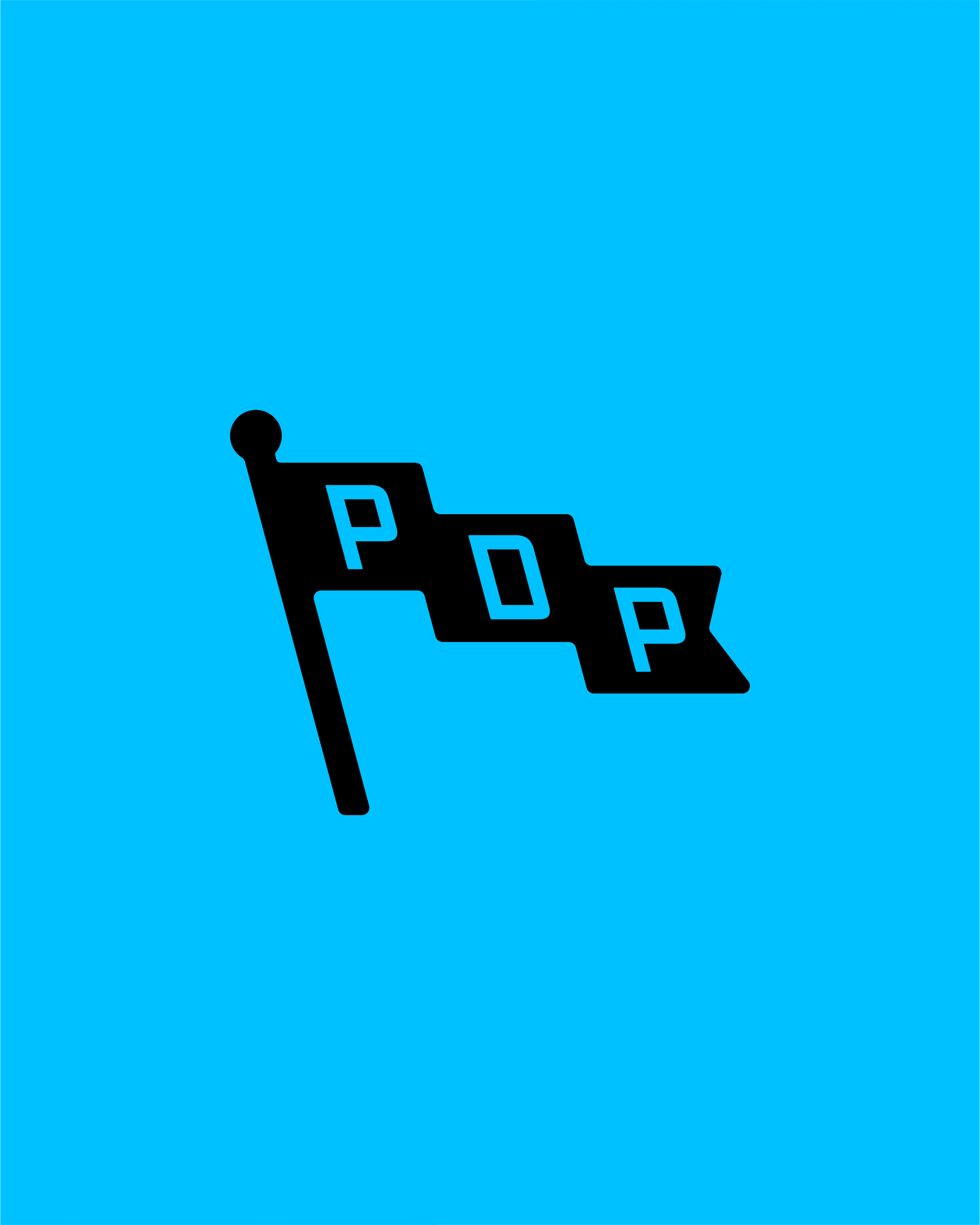
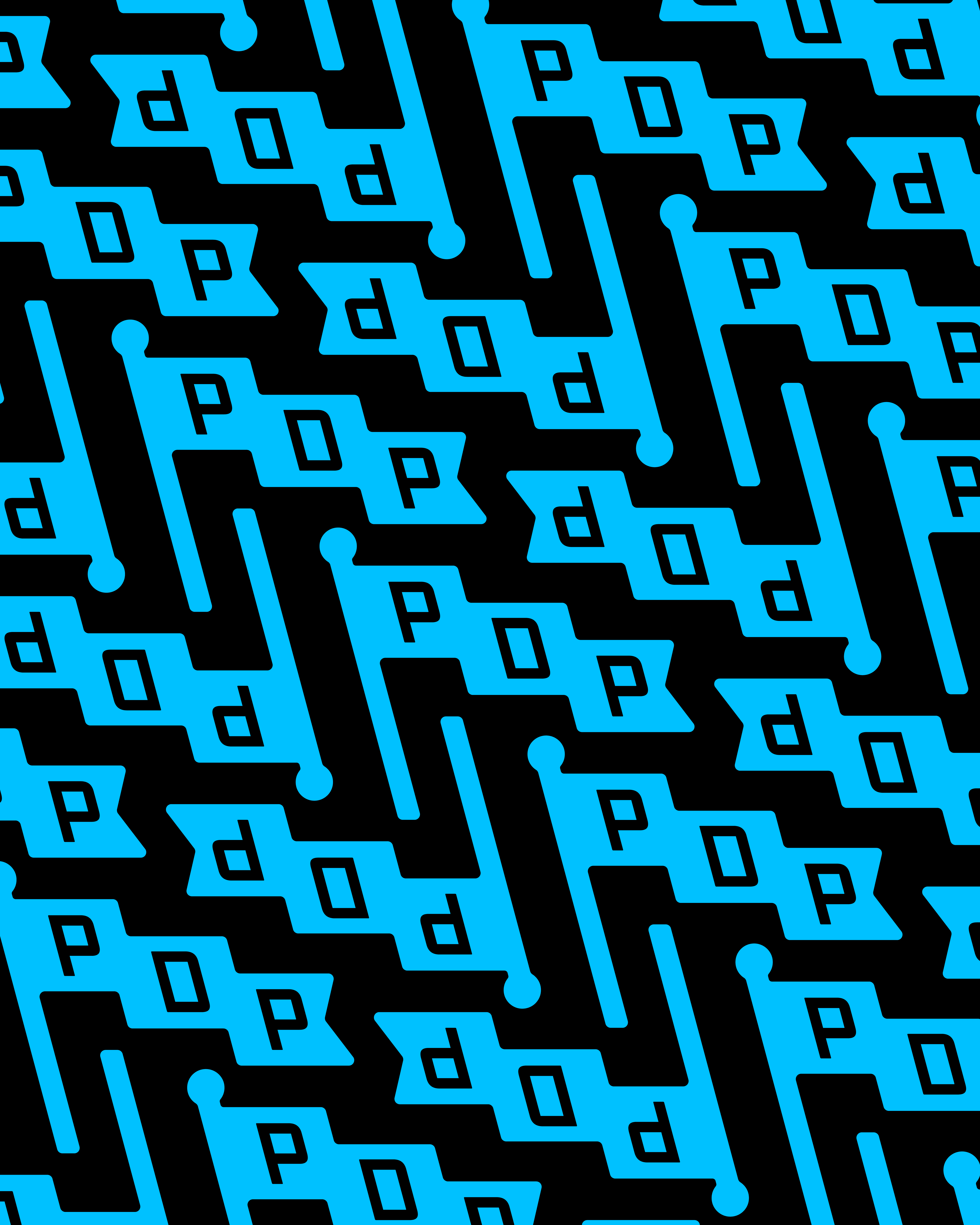
The visual system uses a cyan and black palette for a bold, recognizable look. The main wordmark is a sleek, single-weight cursive, complemented by playful assets including a PDP flag, a globe labeled “Pretty Dope,” and a screen printing icon. These elements create versatility across packaging, promotional materials, and digital media.
The visual system uses a cyan and black palette for a bold, recognizable look. The main wordmark is a sleek, single-weight cursive, complemented by playful assets including a PDP flag, a globe labeled “Pretty Dope,” and a screen printing icon. These elements create versatility across packaging, promotional materials, and digital media.
The visual system uses a cyan and black palette for a bold, recognizable look. The main wordmark is a sleek, single-weight cursive, complemented by playful assets including a PDP flag, a globe labeled “Pretty Dope,” and a screen printing icon. These elements create versatility across packaging, promotional materials, and digital media.
The updated identity gives Pretty Dope Prints a cohesive, memorable presence. By combining a striking palette, dynamic wordmark, and flexible iconography, the brand effectively communicates creativity, professionalism, and local pride.
The updated identity gives Pretty Dope Prints a cohesive, memorable presence. By combining a striking palette, dynamic wordmark, and flexible iconography, the brand effectively communicates creativity, professionalism, and local pride.
The updated identity gives Pretty Dope Prints a cohesive, memorable presence. By combining a striking palette, dynamic wordmark, and flexible iconography, the brand effectively communicates creativity, professionalism, and local pride.