

Native Union
Native Union
Native Union
2026
2026
2026
///
///
Engineering
Engineering
INTRODUCTION
INTRODUCTION
Native Union is a construction and foundation engineering company based in San Diego, California. They, as a company, are focusing on their specific strengths within the Construction Industry.
Native Union is a construction and foundation engineering company based in San Diego, California. They, as a company, are focusing on their specific strengths within the Construction Industry.


Their brief outlined what they wanted in an identity, they said "we want a monogram or icon that will allow us to stand out, but also helps us to be the people who know their strength and work effectively."
Their brief outlined what they wanted in an identity, they said "we want a monogram or icon that will allow us to stand out, but also helps us to be the people who know their strength and work effectively."
The process lead us to explore a variety of industry leaders, as well as many different avenues that could represent their work ethic and process in a honest and effective way.
The process lead us to explore a variety of industry leaders, as well as many different avenues that could represent their work ethic and process in a honest and effective way.
THE CHALLENGE
THE CHALLENGE
The Challenge, was to find a solution that represented Native Union's ownerships personality and work ethich while simultaneously representing the service that they provide with a unique approach.
The Challenge, was to find a solution that represented Native Union's ownerships personality and work ethich while simultaneously representing the service that they provide with a unique approach.


BOOST YOUR BRAND
BOOST YOUR
BRAND
BOOST YOUR
BRAND
Every brand needs an edge. We build ones that stand out with character
SOLUTIONS
SOLUTIONS
This direction had the most alligned with the inital brief, it also represented Native Union closely and most honestly. That's what makes it the most effective direction and the perfect solution for them.
This direction had the most alligned with the inital brief, it also represented Native Union closely and most honestly. That's what makes it the most effective direction and the perfect solution for them.


Finding a solution that helps Native Union quickly showcase who they are and what they can do to potential clients will be a huge step forward in the right direction for them.
Finding a solution that helps Native Union quickly showcase who they are and what they can do to potential clients will be a huge step forward in the right direction for them.
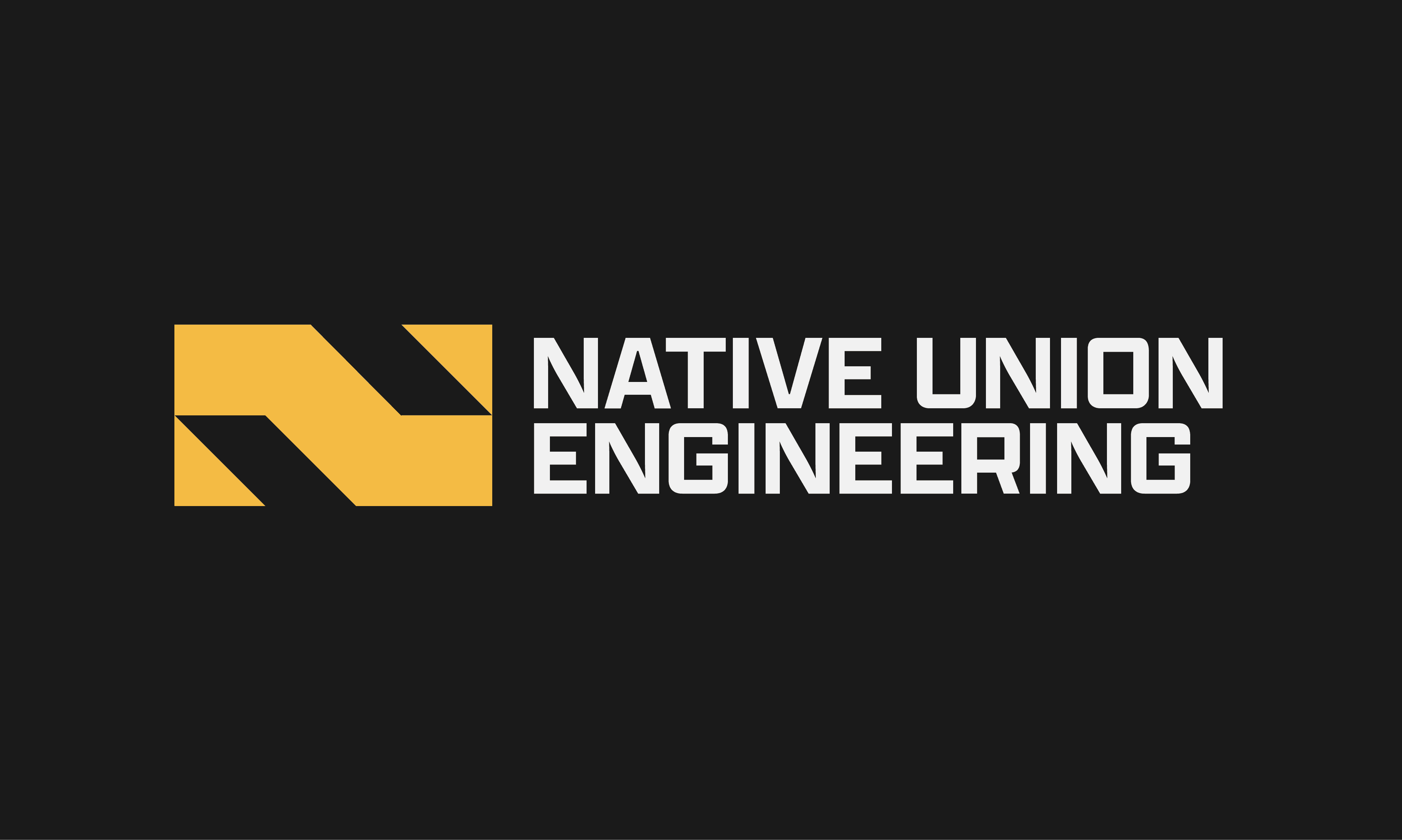

All directions proposed could have worked for them, however, the "Step N" solution was, in my opinion, the most effective solution presented.
All directions proposed could have worked for them, however, the "Step N" solution was, in my opinion, the most effective solution presented.
RESULTS
RESULTS
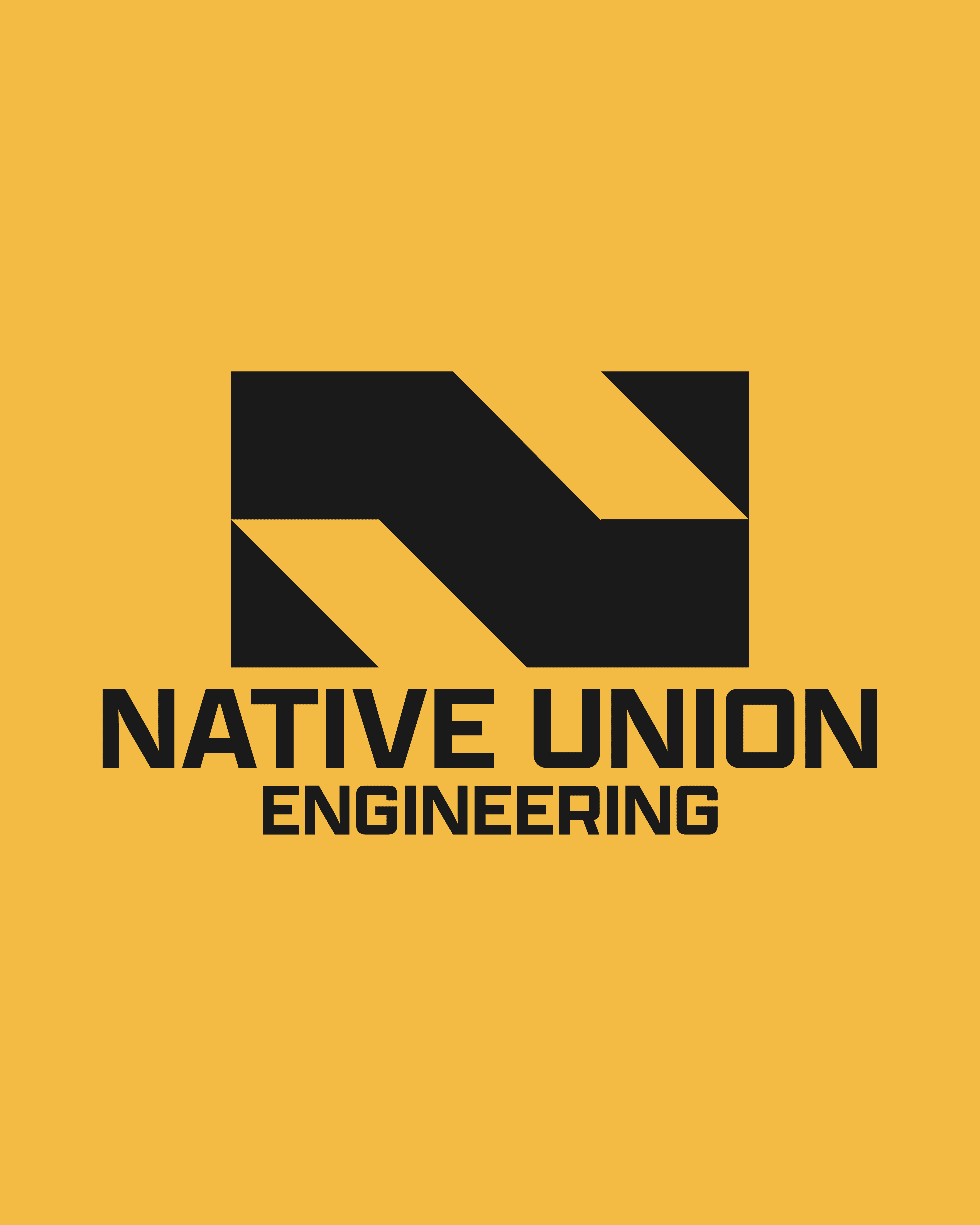
With the overall shape looking like an N and the negative space looking like the tops of Steps or looking like a screed or bull float which is often used in the finishing part of the concrete process. With this new logo, their name doesn't have to do the heavy lifting.
With the overall shape looking like an N and the negative space looking like the tops of Steps or looking like a screed or bull float which is often used in the finishing part of the concrete process. With this new logo, their name doesn't have to do the heavy lifting.


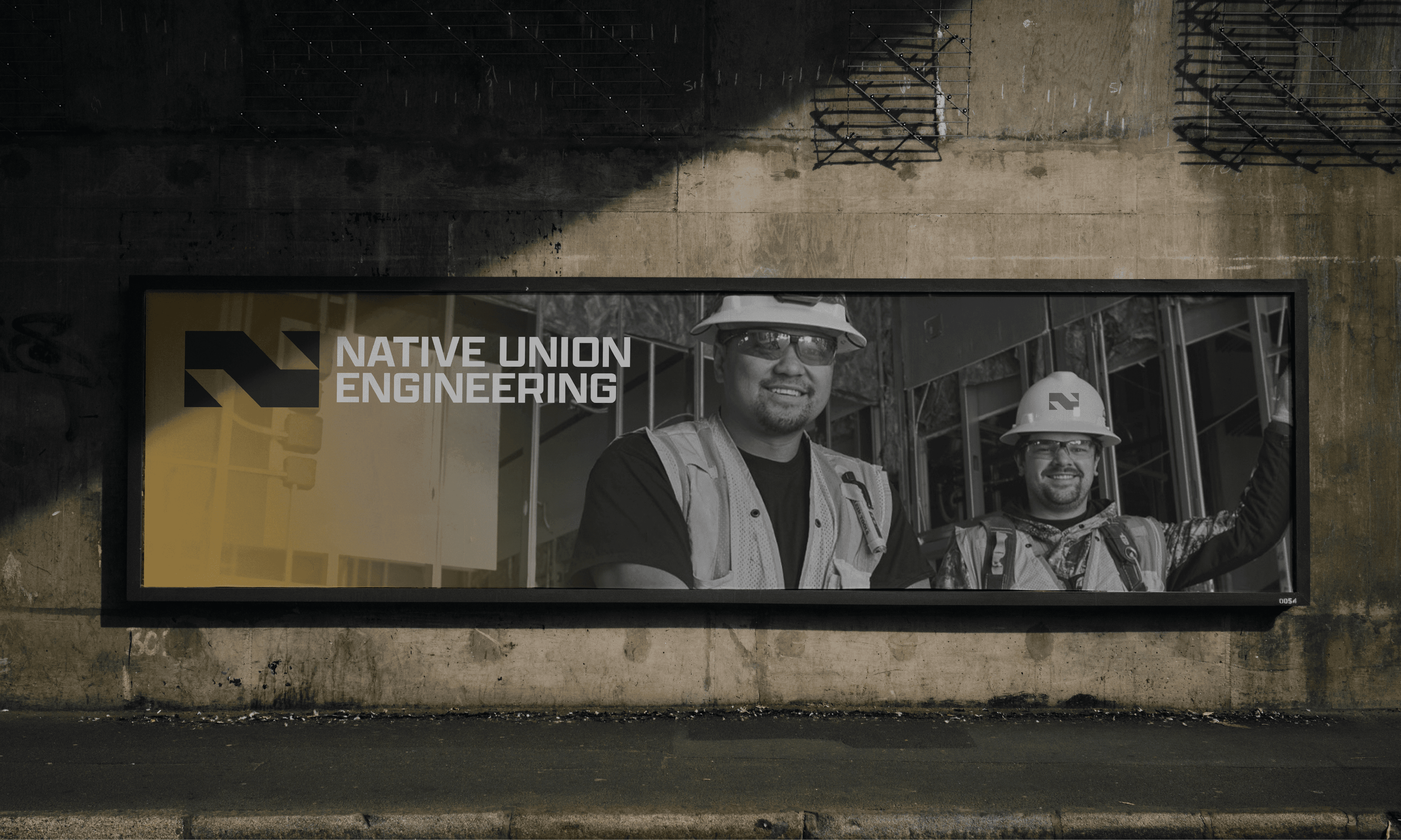
Anyone who interacts with Native Union's brand can assume, based on the geometric approach, that they build things or work closely with that indusry. Their brand can effectively communicate who they are with each piece of their identity, but when it comes together it will be even better for them.
Anyone who interacts with Native Union's brand can assume, based on the geometric approach, that they build things or work closely with that indusry. Their brand can effectively communicate who they are with each piece of their identity, but when it comes together it will be even better for them.
