

Capeta
Capeta
Capeta
2024
2024
///
///
Food & Beverage
Food & Beverage
INTRODUCTION
INTRODUCTION
Capeta's identity doesn't ask for attention — it takes it. Built on raw energy and attitude, it's sharp, loud, and unapologetic: tape-like typography and an electric yellow that punch through the noise and give the brand its rebellious edge. Capeta wasn't trying to go after the hard lemonade brands. They were going after Big Juice. Starting small, with just a logo, they needed their attitude to carry the weight — something their customers could rally around and feel part of.
Capeta's identity doesn't ask for attention — it takes it. Built on raw energy and attitude, it's sharp, loud, and unapologetic: tape-like typography and an electric yellow that punch through the noise and give the brand its rebellious edge. Capeta wasn't trying to go after the hard lemonade brands. They were going after Big Juice. Starting small, with just a logo, they needed their attitude to carry the weight — something their customers could rally around and feel part of.
THE CHALLENGE
THE CHALLENGE
Capeta already had momentum with its original identity: a spunky, scary lemon mascot. The brand still needed to feel sneaky and rebellious, but it also needed to feel more put together — like a real, retail-ready product, not a garage project. A wolf with a sour attitude turned out to be the right character to carry that forward.
Capeta already had momentum with its original identity: a spunky, scary lemon mascot. The brand still needed to feel sneaky and rebellious, but it also needed to feel more put together — like a real, retail-ready product, not a garage project. A wolf with a sour attitude turned out to be the right character to carry that forward.



BOOST YOUR BRAND
BOOST YOUR
BRAND
BOOST YOUR
BRAND


THE SOLUTION
THE SOLUTION
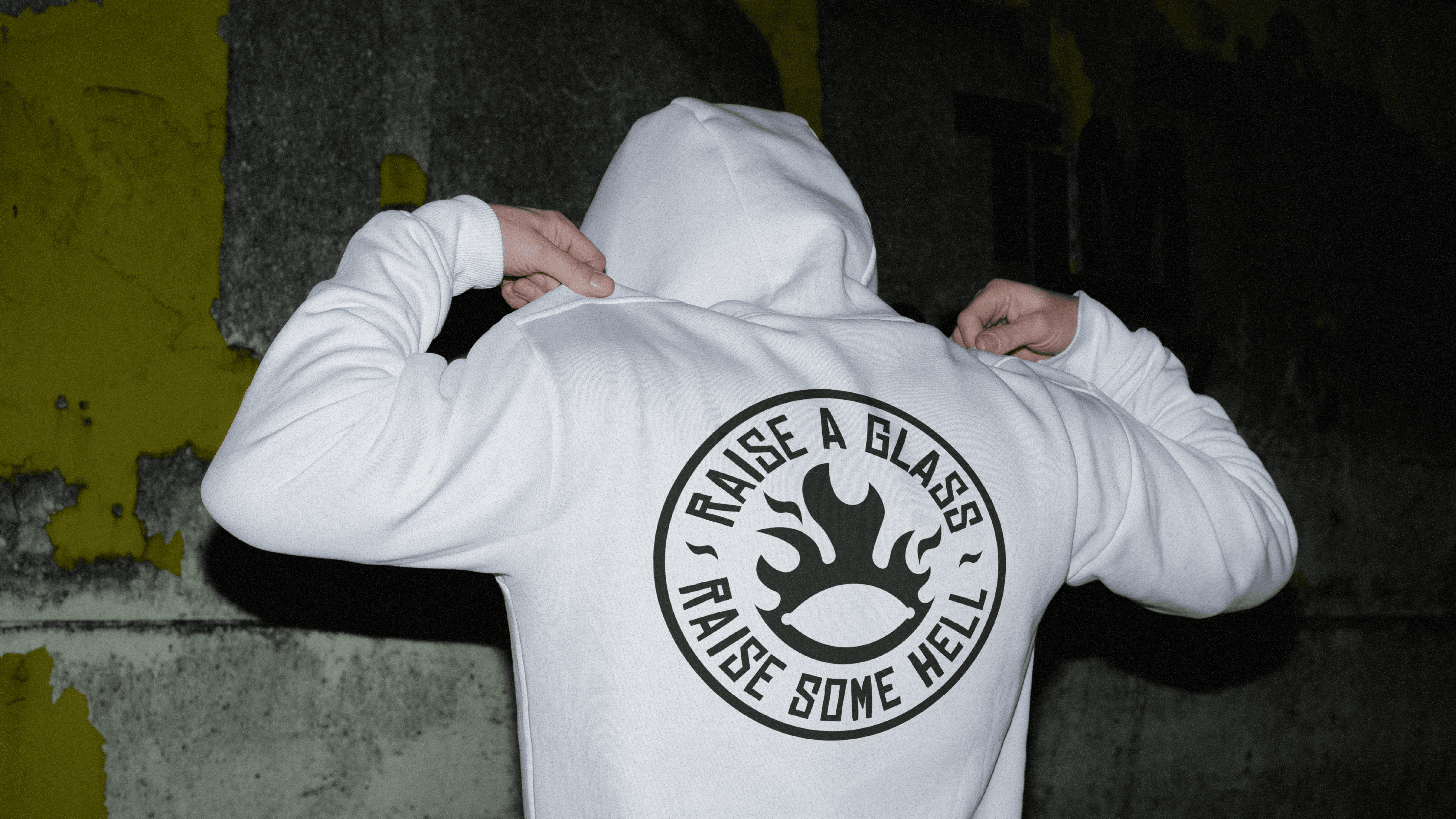
The brief was specific: keep the badge, keep a mascot, keep a nod to the lemon — but build each piece so it could stand on its own across packaging, merch, and social. We dug into early-2000s skateboard graphics, slang, and street art, looking for ways to swap in lemon-specific details and attitude. Once one sticker-style element clicked, the rest of the system followed fast — new graphics, revamped old ones, and a few cut because they didn't earn their place.
The brief was specific: keep the badge, keep a mascot, keep a nod to the lemon — but build each piece so it could stand on its own across packaging, merch, and social. We dug into early-2000s skateboard graphics, slang, and street art, looking for ways to swap in lemon-specific details and attitude. Once one sticker-style element clicked, the rest of the system followed fast — new graphics, revamped old ones, and a few cut because they didn't earn their place.
THE RESULTS
THE RESULTS
The jump from where the brand was to where it landed surprised people — in a good way. Capeta Lemonade's audience embraced it immediately, and the brand is now positioned to take on bigger competitors with an identity that actually backs up its attitude. A brand that looks retail-ready, not garage-made, is what gets a small label taken seriously next to bigger competitors.


