
Wicki Wicki, Wild Wild West
A Journey of a Thousand Miles
Wicki Wicki, Wild Wild West
Wicki Wicki, Wild Wild West
Western Digital is a technology company who has prided themselves on helping brands, on an international level, store data for years. Now, like most companies, they're expanding into AI infrastructure.
In complete honesty, I believe making AI your identity is so common that it isn't the best move right now. The majority of people don’t mind that companies integrate AI, however they still want to see human connection. I don't think that's entirely what WD is doing here. Their CEO, Irving Tan, put it this way:
"WD is a data center company, critical to the growth of AI, and focused on delivering the infrastructure required to scale it. We are a company in motion, built for what comes next."
They're not rebranding to chase something. That part matters. They're catching up to how people already talk about them.
Because of my lack of interaction with them, I didn't know Western Digital. However, legacy brands who have been around for years don't need permission to make the adjustment to a shorter name. Odds are most people are already using the acronym.

I've worked with brands before who used cities as their names, which is great for local businesses. As one in particular grew across the western United States, not everybody knew the small town. Their acronym became more recognizable. When that happens, it's important to lean into it and start to own that space before it’s too late.
The Gradient Problem
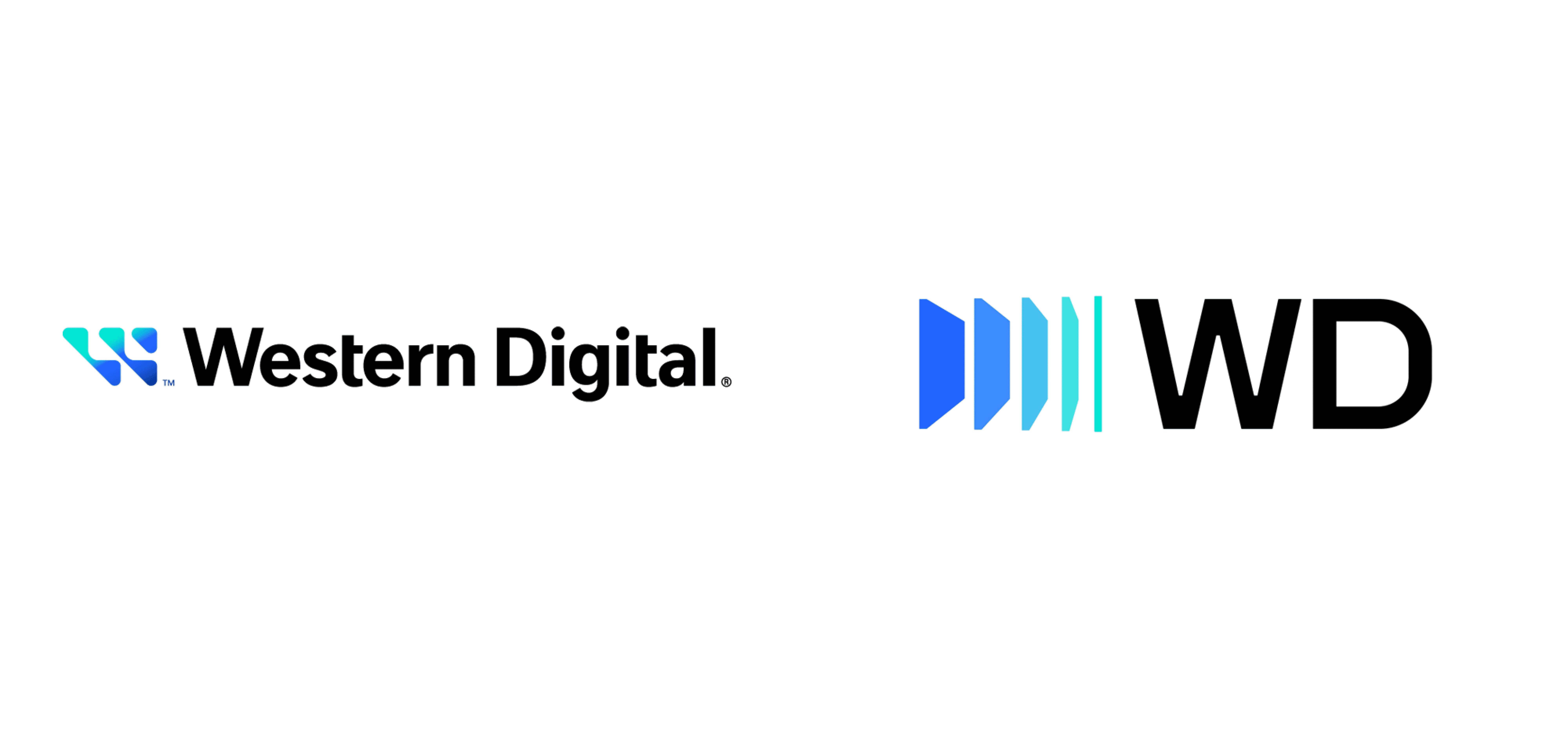
The evolution of the mark itself is what really interests me here.
The old logo looked great, it has a very unique and digital feeling to it. What holds it back is the gradient. Gradients are becoming more popular as digital colors print better, but when improperly used, or associated with the digital realm, the gradient can feel like it’s right out of the “Y2K era” of branding and design.
The updated system separates that gradient. Each shape now has its own shade, its own tone. It's a smart move. The sense of progression is still there. They can still use the feeling of movement, data transferring without needing the gradient.
This adjustment feels more in line with who they are recognized as and where their updated mission is wanting them to go.
Realignment over Reinvention
This kind of rebrand didn’t push for a complete 180 in identity. It updated dated elements in their identity to realign with who they want to be seen as now.
Where they were wasn’t bad, but it was probably more aligned with who they were in the beginning or who they were 10-20 years ago. With tech and digital changing so much it’s crucial to know when slight adjustments are necessary.

I think this is similar to what a lot of brands do when they reach this point. Small, methodical changes that result in better acceptance. Better integration of identity.
Because smaller changes are easier to digest than complete overhauls.
Sometimes the best rebrand is the one that doesn't feel like a rebrand at all.
Western Digital is a technology company who has prided themselves on helping brands, on an international level, store data for years. Now, like most companies, they're expanding into AI infrastructure.
In complete honesty, I believe making AI your identity is so common that it isn't the best move right now. The majority of people don’t mind that companies integrate AI, however they still want to see human connection. I don't think that's entirely what WD is doing here. Their CEO, Irving Tan, put it this way:
"WD is a data center company, critical to the growth of AI, and focused on delivering the infrastructure required to scale it. We are a company in motion, built for what comes next."
They're not rebranding to chase something. That part matters. They're catching up to how people already talk about them.
Because of my lack of interaction with them, I didn't know Western Digital. However, legacy brands who have been around for years don't need permission to make the adjustment to a shorter name. Odds are most people are already using the acronym.
I've worked with brands before who used cities as their names, which is great for local businesses. As one in particular grew across the western United States, not everybody knew the small town. Their acronym became more recognizable. When that happens, it's important to lean into it and start to own that space before it’s too late.
The Gradient Problem
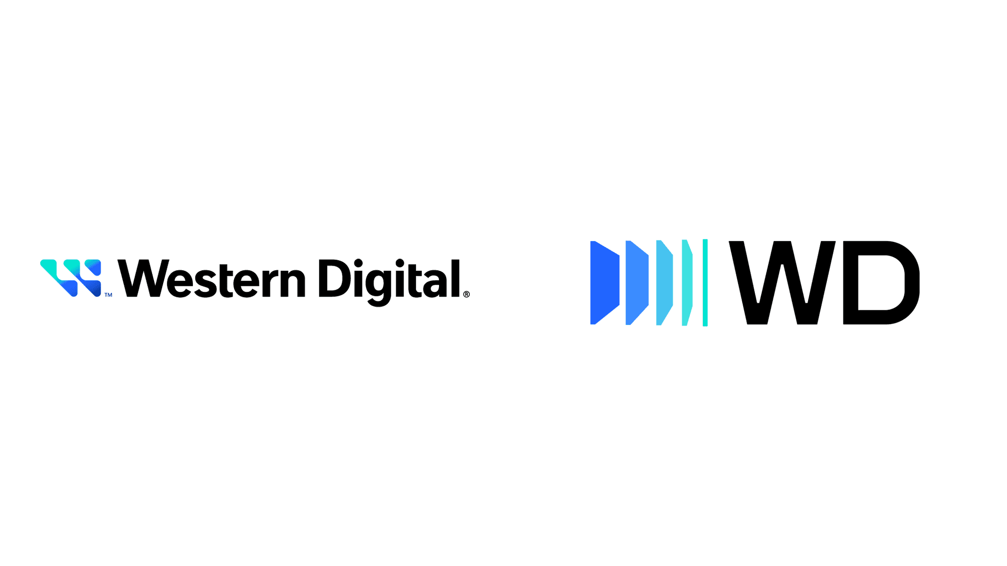
The evolution of the mark itself is what really interests me here.
The old logo looked great, it has a very unique and digital feeling to it. What holds it back is the gradient. Gradients are becoming more popular as digital colors print better, but when improperly used, or associated with the digital realm, the gradient can feel like it’s right out of the “Y2K era” of branding and design.
The updated system separates that gradient. Each shape now has its own shade, its own tone. It's a smart move. The sense of progression is still there. They can still use the feeling of movement, data transferring without needing the gradient.
This adjustment feels more in line with who they are recognized as and where their updated mission is wanting them to go.
Realignment over Reinvention
This kind of rebrand didn’t push for a complete 180 in identity. It updated dated elements in their identity to realign with who they want to be seen as now.
Where they were wasn’t bad, but it was probably more aligned with who they were in the beginning or who they were 10-20 years ago. With tech and digital changing so much it’s crucial to know when slight adjustments are necessary.
I think this is similar to what a lot of brands do when they reach this point. Small, methodical changes that result in better acceptance. Better integration of identity.
Because smaller changes are easier to digest than complete overhauls.
Sometimes the best rebrand is the one that doesn't feel like a rebrand at all.