

Is All Publicity Good Publicity?
A Journey of a Thousand Miles
Is All Publicity Good Publicity?
Is All Publicity Good Publicity?
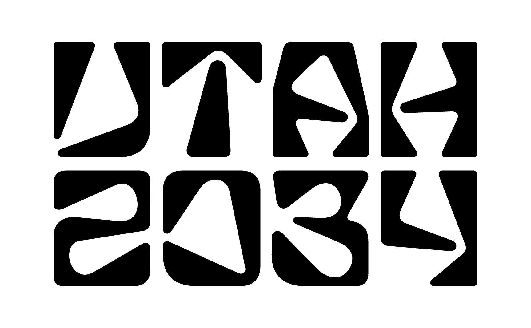
A few weeks ago the Olympic committee who is set to oversee the events and the visual identity for the Salt Lake, now Utah, 2034 Olympics released what I believe to be the city or candidate logo. When it came out, it sparked a wide range of outrage among people who love the Olympics, people who love talking about logos, and people who just want to share their opinion. All of that is fine. I love the Olympics. I love talking about design. And I definitely have opinions.
The hardest part about these branding releases is that most reactions come down to a quick two second judgment of one single element in a complete brand system. People forget that logos are only one part of a much larger identity.
Nostalgia is not a Good Benchmark
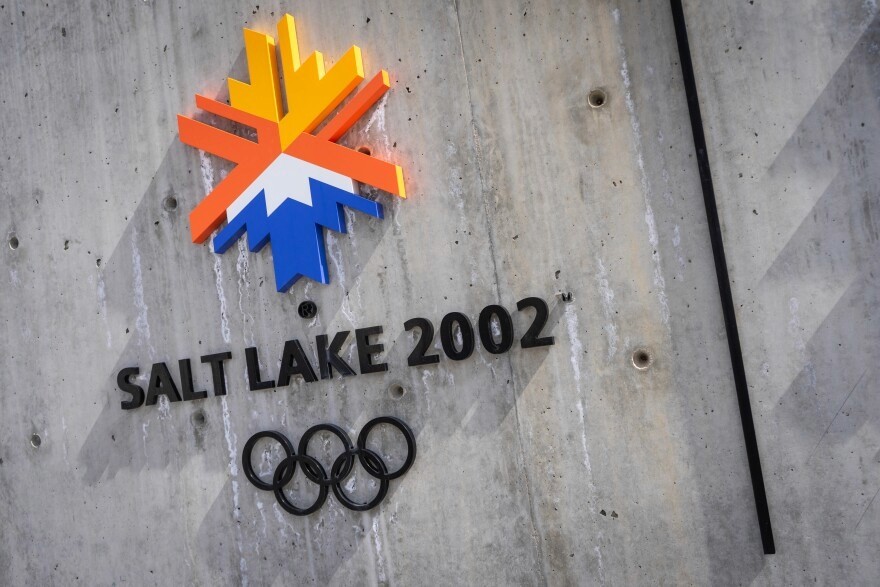
As someone who was pretty young during the 2002 Salt Lake City Olympics, it is hard for me to share the same level of love and nostalgia that others have for that brand identity. But as a Utah resident, I still drive past buildings and structures that carry that old system. Those pieces of design remind me that Utah was part of Olympic history, and I love that.
But I doubt that when the 2002 logo was first released everyone immediately loved it. Some people probably did, but over time everybody grew to love it. Nostalgia always makes something look better in hindsight.
Controversy isn’t New
This kind of reaction is not unique to Utah. It happens with many brands throughout history and with many sporting events as they change identity systems.
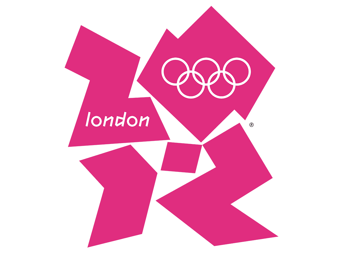
Take the 2012 London Olympic logo. People still complain about it. Many hated it from day one. They thought it was hard to read, too chaotic, and unrelated to London or the United Kingdom. But they did not change it. And whether you like it or not, it has become one of the most recognizable identity systems in modern Olympic history.
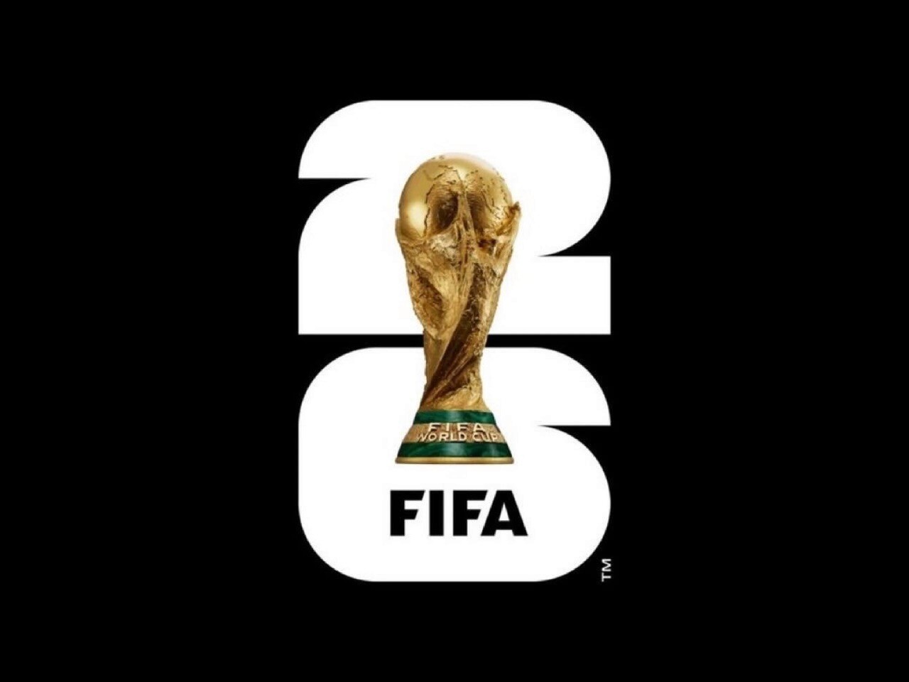
Now look at the FIFA 2026 logo. Many previous FIFA tournament identities had a symbol or graphic that carried through all the event design. But for 2026, the direction shifted toward bold shapes that simply resemble the year of the event, with the trophy placed in the middle. At first it was criticized for lacking creativity or not representing the host countries. But honestly, that simplicity gave the rest of the event graphics room to shine.
What Works?
When it comes to the Utah 2034 branding, I do not see any real issue. People say it is illegible, but what exactly needs to be read? If you look at the snowflake from the 2002 Olympics, what does it say? Can you read it as a word? No. But it is recognizable, memorable, and tightly associated with that specific Olympic Games.
The same thing applies to the 2034 version. Just because the mark uses letterforms does not mean the letters must be instantly readable. The logo, wordmark, or whatever you want to call it, is very unique and very memorable. Its ties to Utah and its landscape are well done and honestly one of my favorite parts.
“I love that it’s got people talking. We could’ve done Times New Roman and called it a day, and nobody would have said anything. At least people are talking about the logo, and it’s getting a lot of attention.”
— Governor Spencer Cox, KSL News

Let the System Speak
If you are still unsatisfied with the Utah 2034 logo, give it time. Eventually you will either see what makes it a strong representation of Utah, or you will simply get used to it and start associating it with the Games. That is how visual identities work. They grow on people.
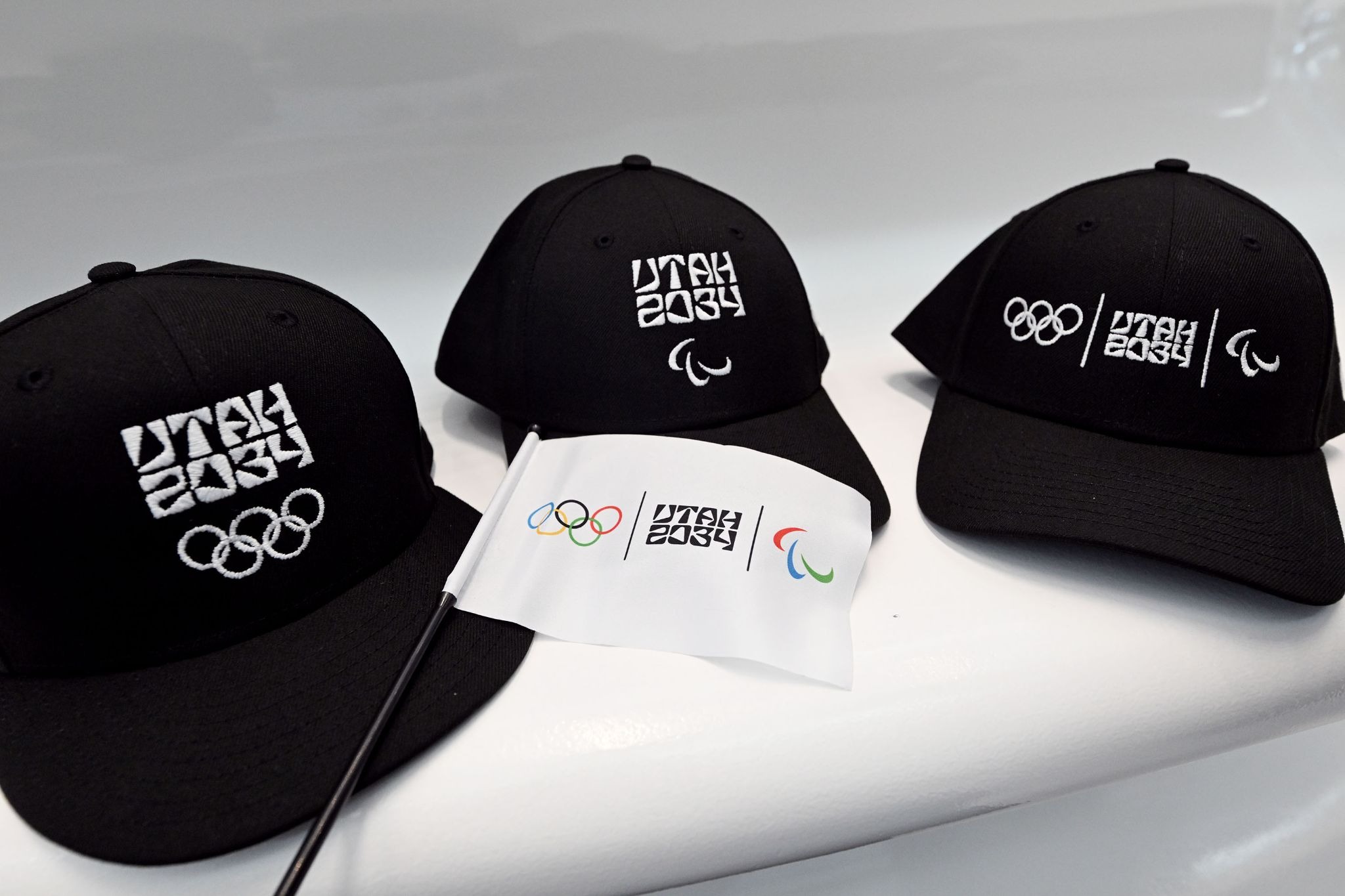
The next time you see a brand reveal that shows only the logo, be curious instead of reactive. Look for the entire identity system. Try to understand the direction, the application, and the purpose before forming a two second opinion. Most branding choices make sense only when you see them in motion, on signage, on clothing, or across a complete event identity.
A few weeks ago the Olympic committee who is set to oversee the events and the visual identity for the Salt Lake, now Utah, 2034 Olympics released what I believe to be the city or candidate logo. When it came out, it sparked a wide range of outrage among people who love the Olympics, people who love talking about logos, and people who just want to share their opinion. All of that is fine. I love the Olympics. I love talking about design. And I definitely have opinions.
The hardest part about these branding releases is that most reactions come down to a quick two second judgment of one single element in a complete brand system. People forget that logos are only one part of a much larger identity.
Nostalgia is not a Good Benchmark
As someone who was pretty young during the 2002 Salt Lake City Olympics, it is hard for me to share the same level of love and nostalgia that others have for that brand identity. But as a Utah resident, I still drive past buildings and structures that carry that old system. Those pieces of design remind me that Utah was part of Olympic history, and I love that.
But I doubt that when the 2002 logo was first released everyone immediately loved it. Some people probably did, but over time everybody grew to love it. Nostalgia always makes something look better in hindsight.
Controversy isn’t New
This kind of reaction is not unique to Utah. It happens with many brands throughout history and with many sporting events as they change identity systems.
Take the 2012 London Olympic logo. People still complain about it. Many hated it from day one. They thought it was hard to read, too chaotic, and unrelated to London or the United Kingdom. But they did not change it. And whether you like it or not, it has become one of the most recognizable identity systems in modern Olympic history.
Now look at the FIFA 2026 logo. Many previous FIFA tournament identities had a symbol or graphic that carried through all the event design. But for 2026, the direction shifted toward bold shapes that simply resemble the year of the event, with the trophy placed in the middle. At first it was criticized for lacking creativity or not representing the host countries. But honestly, that simplicity gave the rest of the event graphics room to shine.
What Works?
When it comes to the Utah 2034 branding, I do not see any real issue. People say it is illegible, but what exactly needs to be read? If you look at the snowflake from the 2002 Olympics, what does it say? Can you read it as a word? No. But it is recognizable, memorable, and tightly associated with that specific Olympic Games.
The same thing applies to the 2034 version. Just because the mark uses letterforms does not mean the letters must be instantly readable. The logo, wordmark, or whatever you want to call it, is very unique and very memorable. Its ties to Utah and its landscape are well done and honestly one of my favorite parts.
“I love that it’s got people talking. We could’ve done Times New Roman and called it a day, and nobody would have said anything. At least people are talking about the logo, and it’s getting a lot of attention.”
— Governor Spencer Cox, KSL News
Let the System Speak
If you are still unsatisfied with the Utah 2034 logo, give it time. Eventually you will either see what makes it a strong representation of Utah, or you will simply get used to it and start associating it with the Games. That is how visual identities work. They grow on people.
The next time you see a brand reveal that shows only the logo, be curious instead of reactive. Look for the entire identity system. Try to understand the direction, the application, and the purpose before forming a two second opinion. Most branding choices make sense only when you see them in motion, on signage, on clothing, or across a complete event identity.