4rest Paper
4rest Paper
4rest Paper
2020
2020
4rest Paper is a planner and notebook company built around simplifying the process of “remembering everything.” What began as sketches of planner layouts that worked best for the founder grew into a brand dedicated to organization through clarity and functionality.
4rest Paper is a planner and notebook company built around simplifying the process of “remembering everything.” What began as sketches of planner layouts that worked best for the founder grew into a brand dedicated to organization through clarity and functionality.
4rest Paper is a planner and notebook company built around simplifying the process of “remembering everything.” What began as sketches of planner layouts that worked best for the founder grew into a brand dedicated to organization through clarity and functionality.
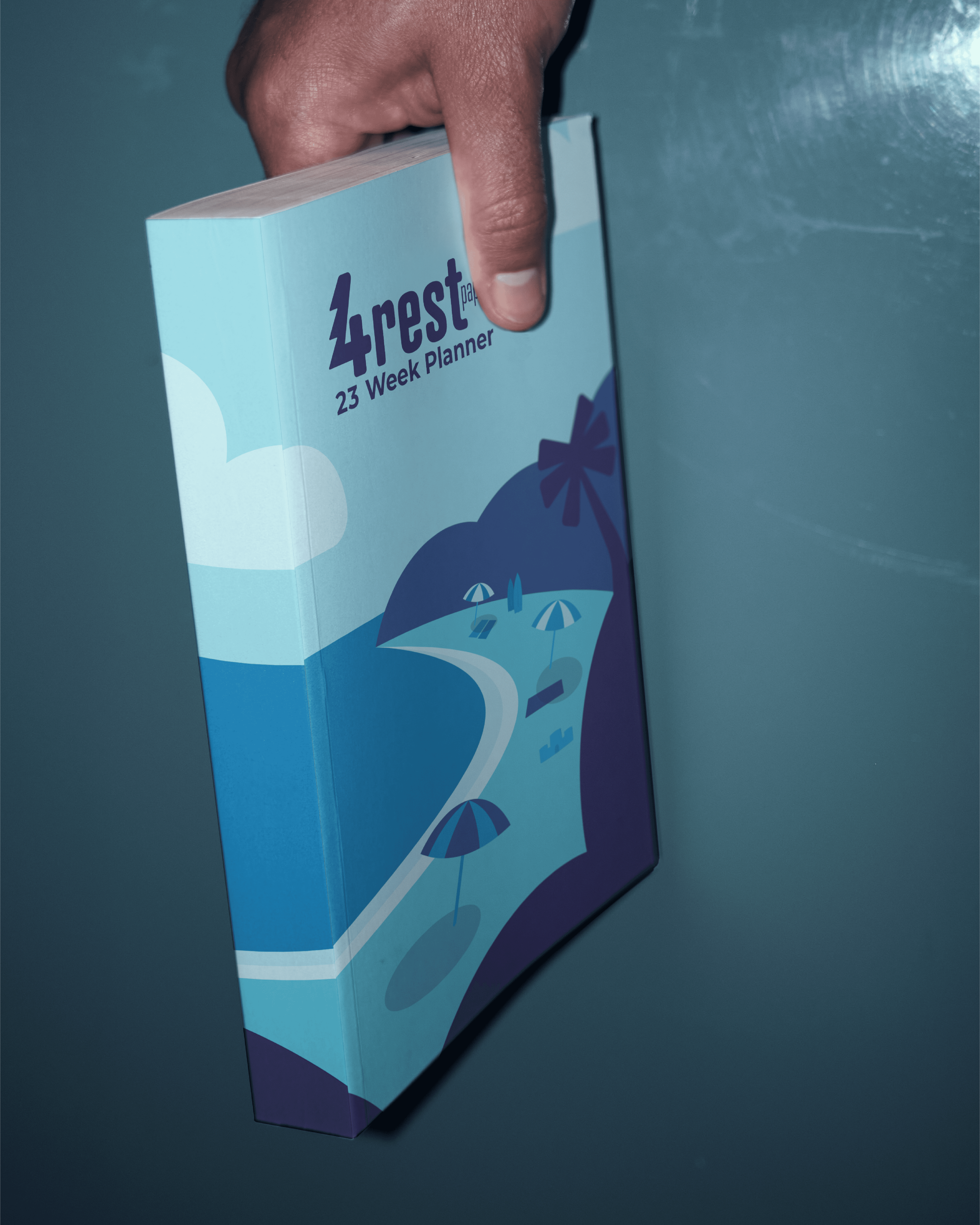

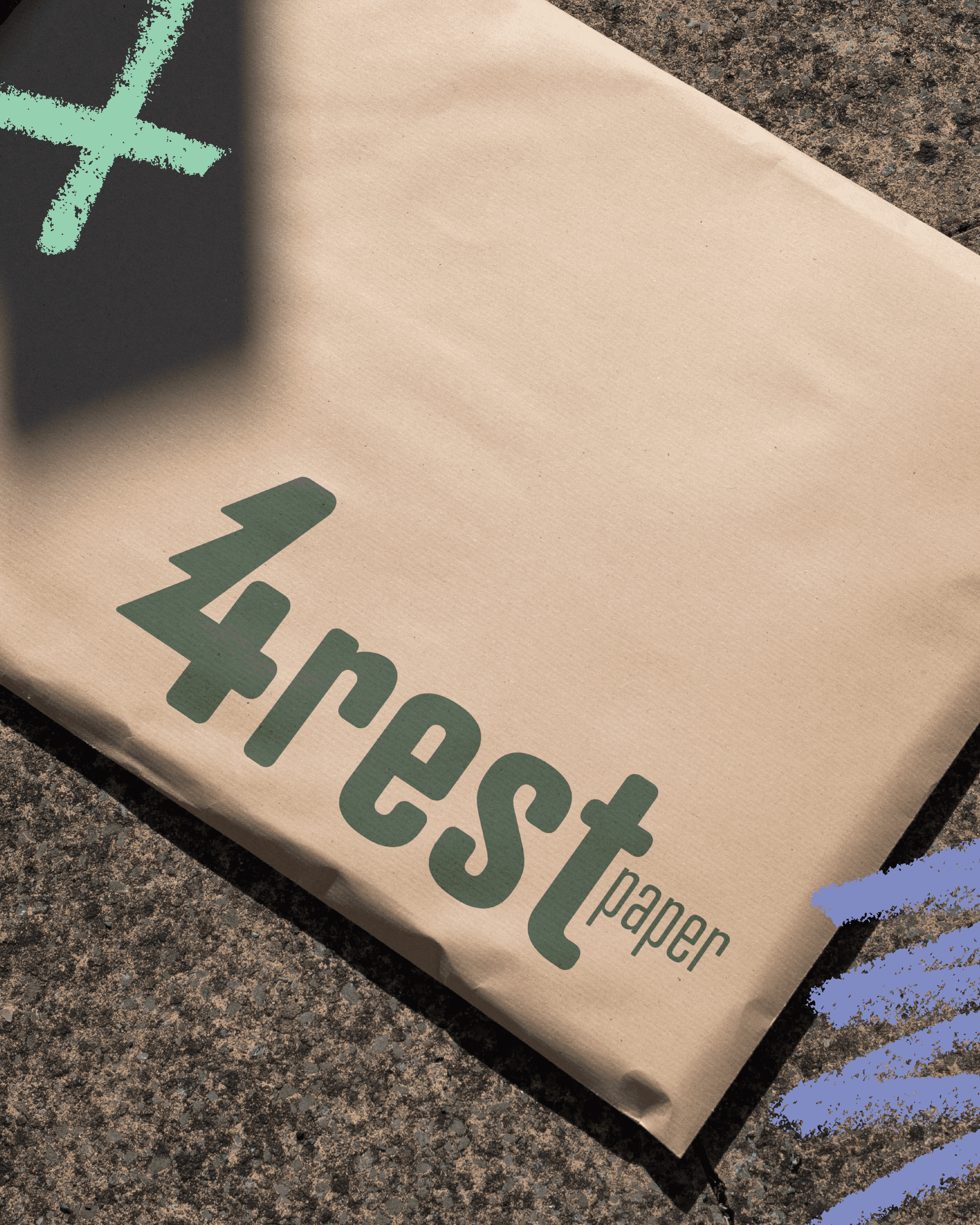
Beyond the logo, the brand required notebook layouts and social media templates. To keep their communication as simple as their product, we created a flexible brand system—complete with iconography, illustrations, and secondary elements—ensuring consistency across every platform while helping them connect with their target audience.
Beyond the logo, the brand required notebook layouts and social media templates. To keep their communication as simple as their product, we created a flexible brand system—complete with iconography, illustrations, and secondary elements—ensuring consistency across every platform while helping them connect with their target audience.
Beyond the logo, the brand required notebook layouts and social media templates. To keep their communication as simple as their product, we created a flexible brand system—complete with iconography, illustrations, and secondary elements—ensuring consistency across every platform while helping them connect with their target audience.

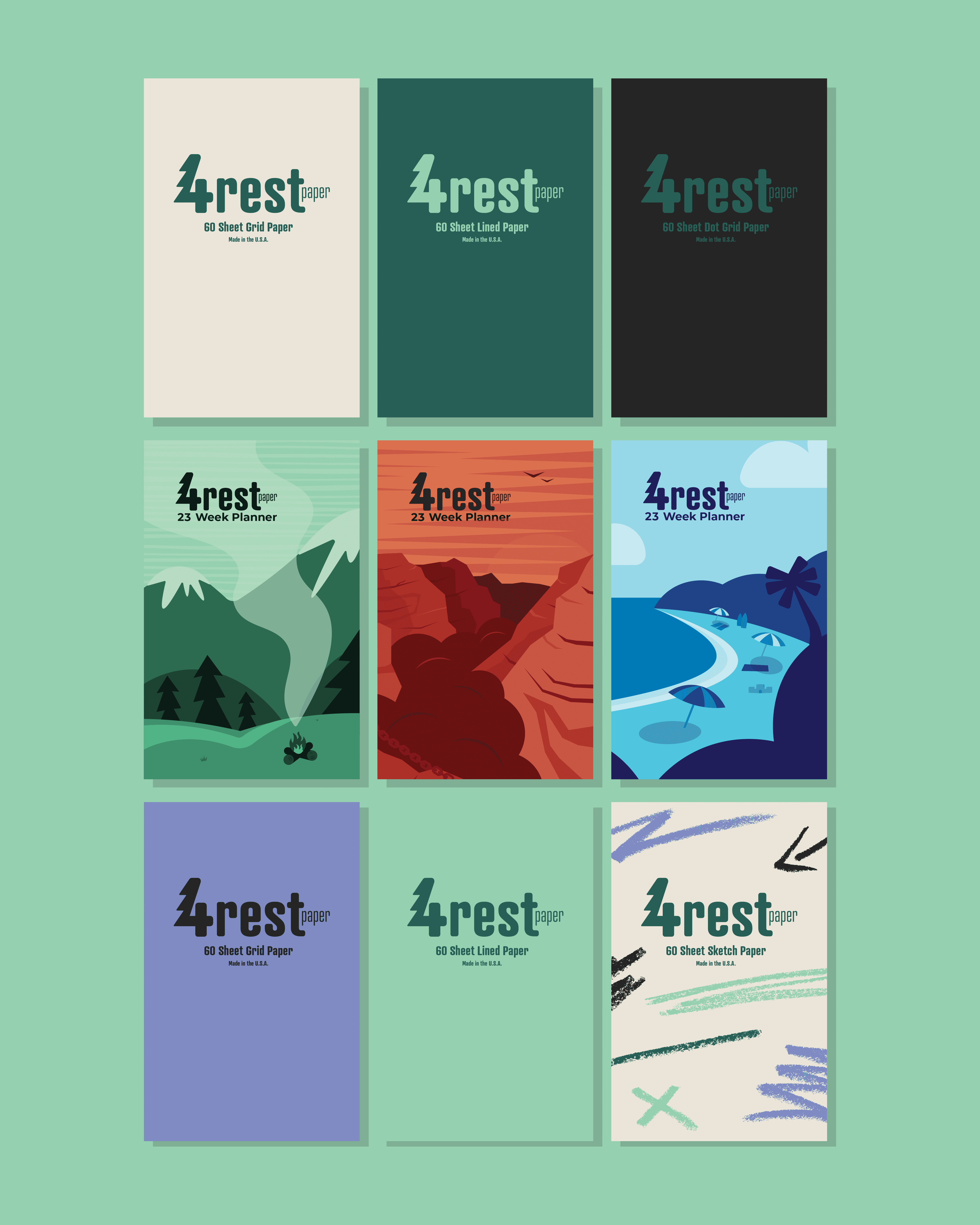
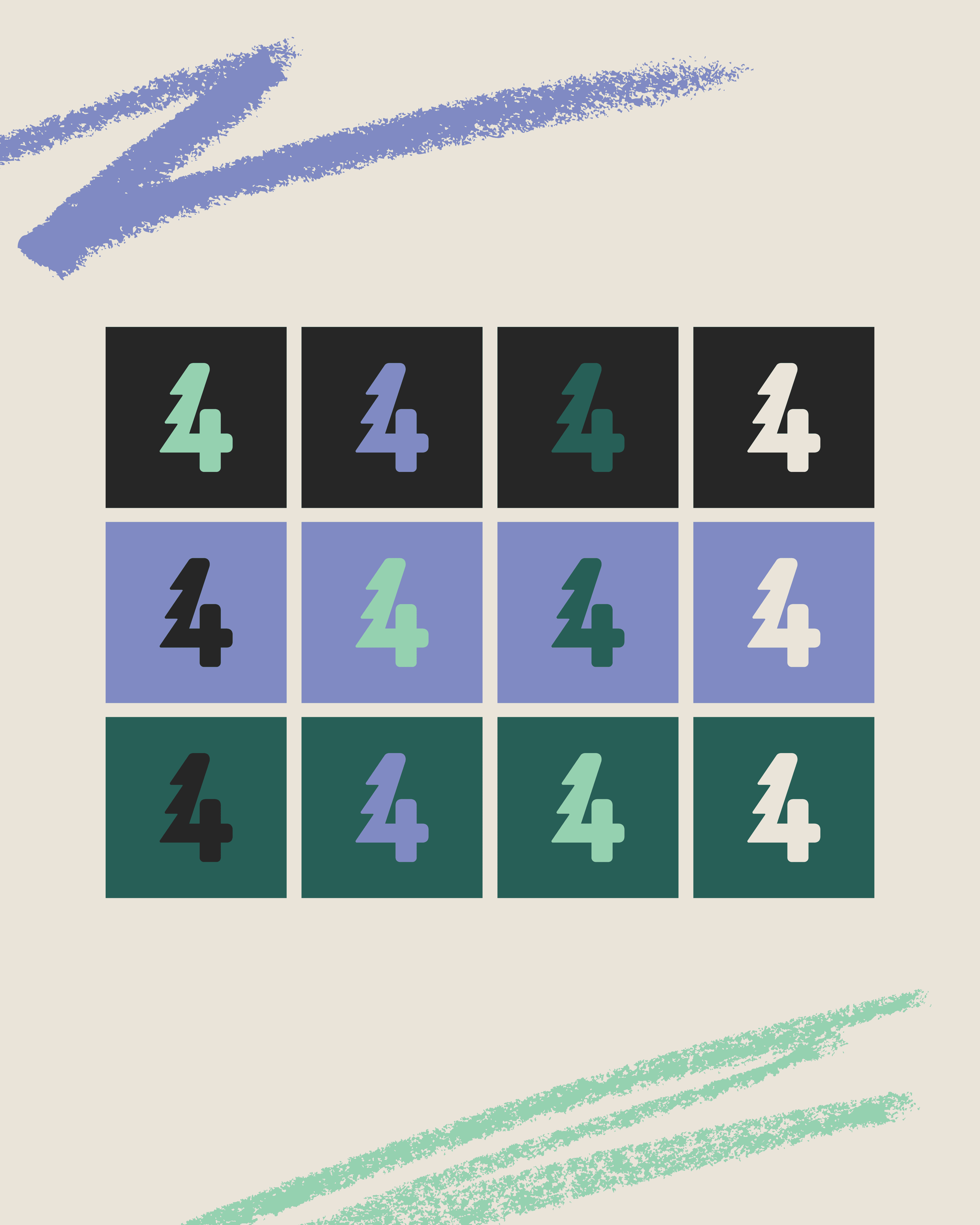
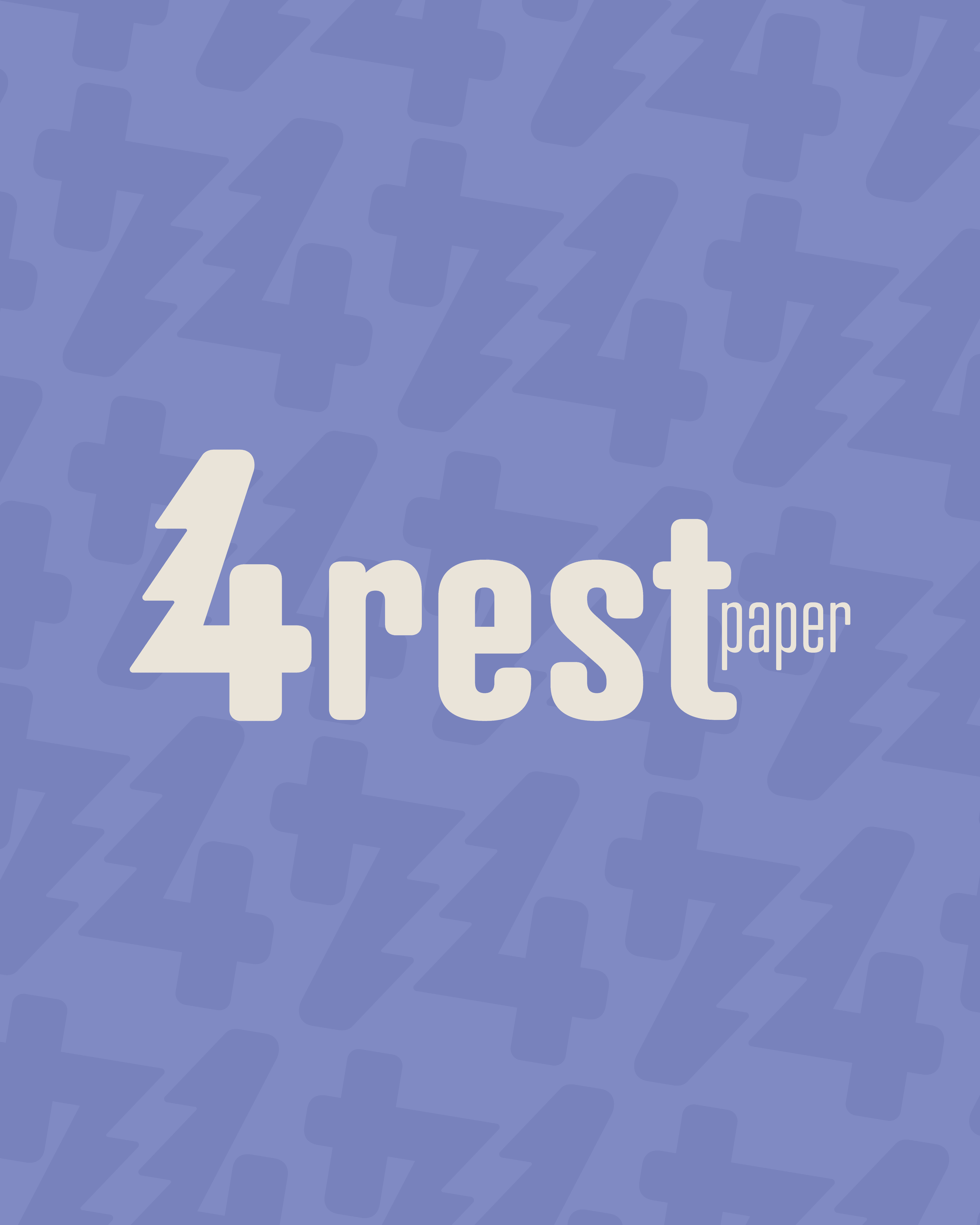
The wordmark became the centerpiece of the identity, reflecting the founder’s desire for an outdoors-focused feel. The subtle tree integrated into the “4” paired with approachable typography creates a mark that balances personality with practicality.
The wordmark became the centerpiece of the identity, reflecting the founder’s desire for an outdoors-focused feel. The subtle tree integrated into the “4” paired with approachable typography creates a mark that balances personality with practicality.
The wordmark became the centerpiece of the identity, reflecting the founder’s desire for an outdoors-focused feel. The subtle tree integrated into the “4” paired with approachable typography creates a mark that balances personality with practicality.